Company
PromoTix is a zero-fee ticketing platform for in-person and virtual events. PromoTix is the industry's best marketing software backed by the world's only free ticketing platform.
PromoTix has helped music festivals and venues sell $250K – $5M increase in their profit margin to 32% and attendance by 20%.
PromoTix has helped music festivals and venues sell $250K – $5M increase in their profit margin to 32% and attendance by 20%.
Challenge
The Senior Product Designer brought a design team together to assist in revamping the PromoTix mobile/web application suite and overall branding, including animation work, marketing materials, and additional UX when needed.
Team
The team consists of 7 developers, 5 marketing experts, and the Senior Product Designer along with 2 other designers, and myself.
I worked on mobile and web applications for the suite in addition to marketing materials and animation work.
I worked on mobile and web applications for the suite in addition to marketing materials and animation work.
Custom Mobile App
The Custom Mobile App is for the Event Organizers to create an application for the individual event or festival they are hosting.
The Custom Mobile App is for the Event Organizers to create an application for the individual event or festival they are hosting.
The team was presented with the problem that the mobile/web applications needed to be revised and functionality needed to be improved. VP of Client Success mentioned users showing discontent with the suite’s difficult navigation, discoverability issues, and lacking the usability principles of consistency. So our goal with this project was to fix the issues causing users to discontinue using the product and overall discontinue using the application suite.
I conducted product reviews and research on pain points going on in the application process and initial product. The primary pain points I found were the following:
I conducted product reviews and research on pain points going on in the application process and initial product. The primary pain points I found were the following:
UX Pain Points
• Tasks had unnecessary steps in user flow
• Tasks needing specific info but also not needed
• Uncertainty on product use without reading FAQ
• Struggle to navigate apps when completing tasks/flow
• Completing task/creating an app for the event did not indicate success or completion
• Tasks had unnecessary steps in user flow
• Tasks needing specific info but also not needed
• Uncertainty on product use without reading FAQ
• Struggle to navigate apps when completing tasks/flow
• Completing task/creating an app for the event did not indicate success or completion
UI Pain Points
• Colors don't match PromoTix brand
• Type and buttons are difficult to read (legibility, contrast, and proximity issues)
• Buttons were hidden within an untidy layout
• Buttons and info design were not consistent
• Colors don't match PromoTix brand
• Type and buttons are difficult to read (legibility, contrast, and proximity issues)
• Buttons were hidden within an untidy layout
• Buttons and info design were not consistent
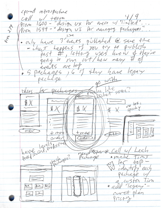
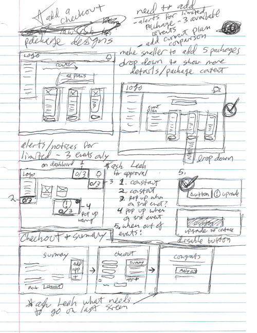
After the team came together, we presented our findings and ideas about how to solve the issues. I had sketched my solutions and wireframes to present to the team.
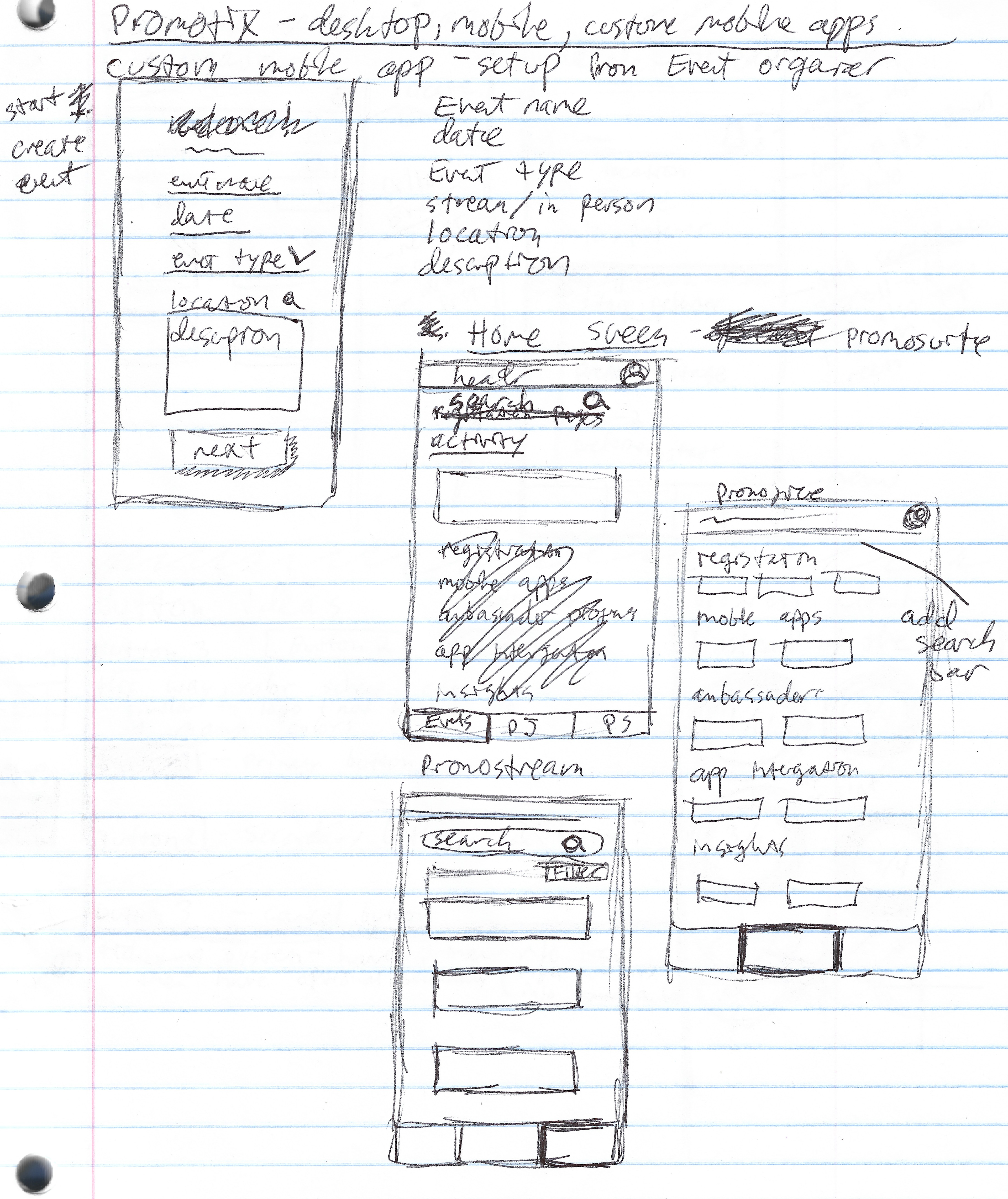
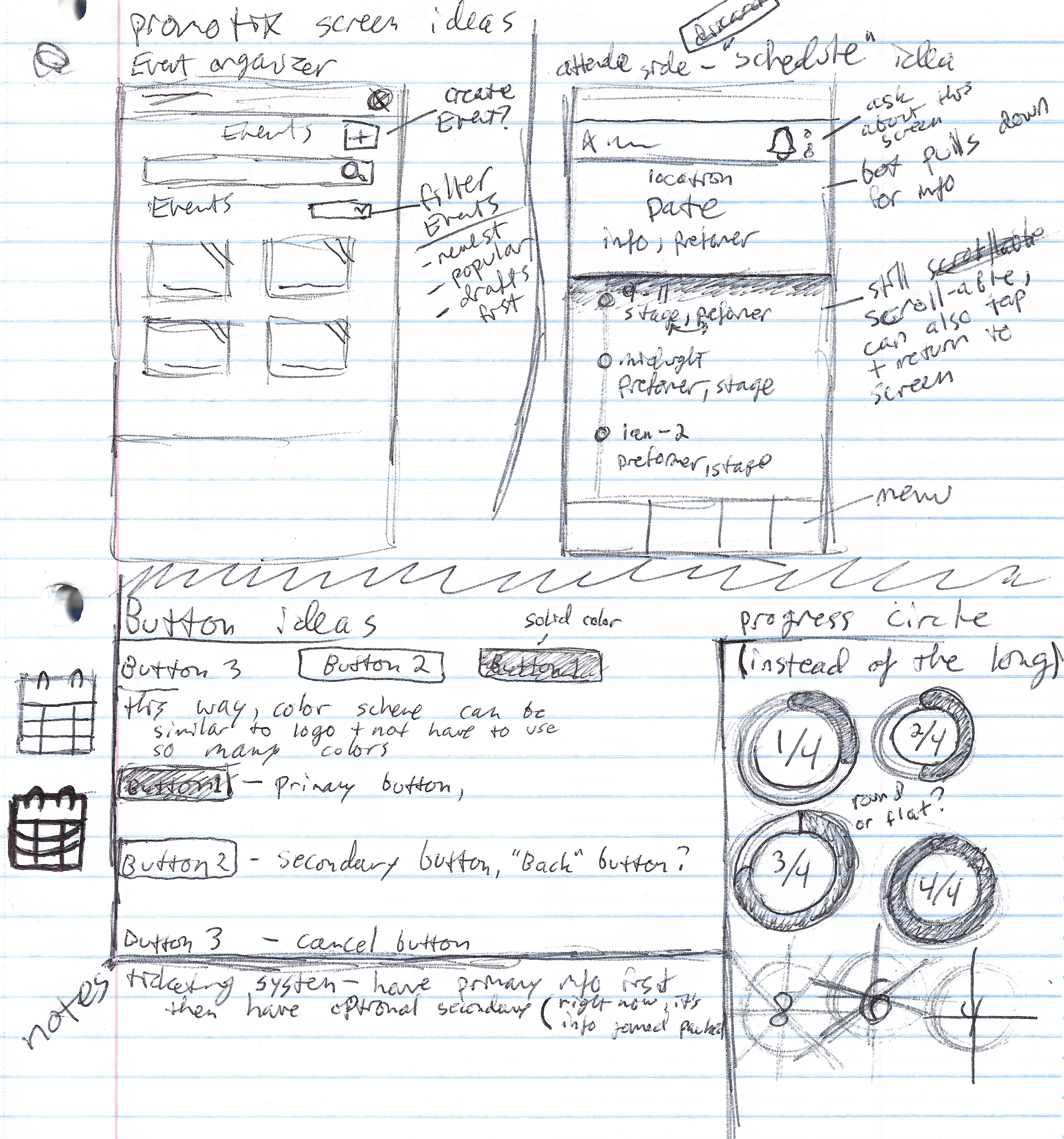
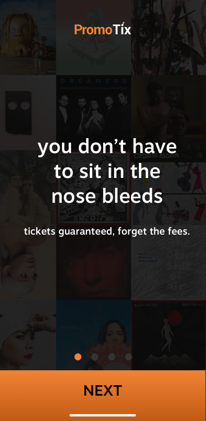
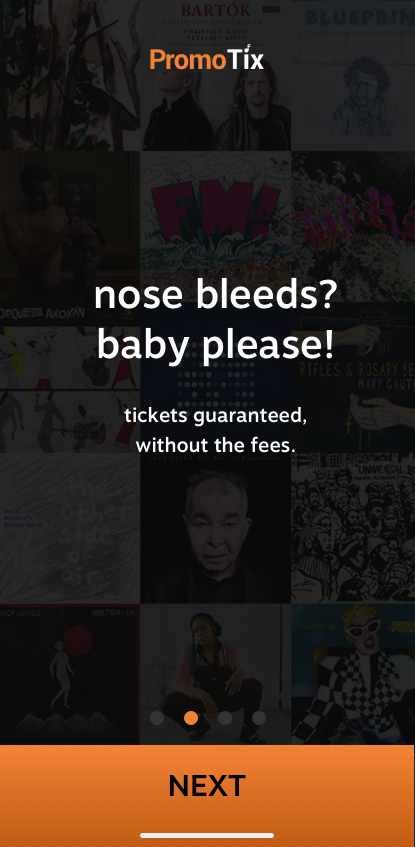
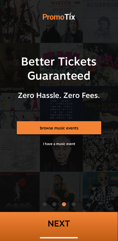
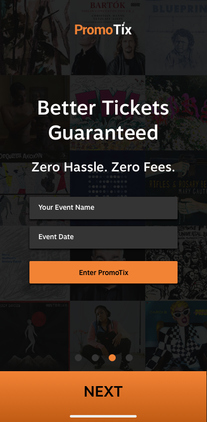
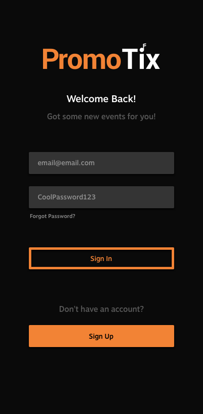
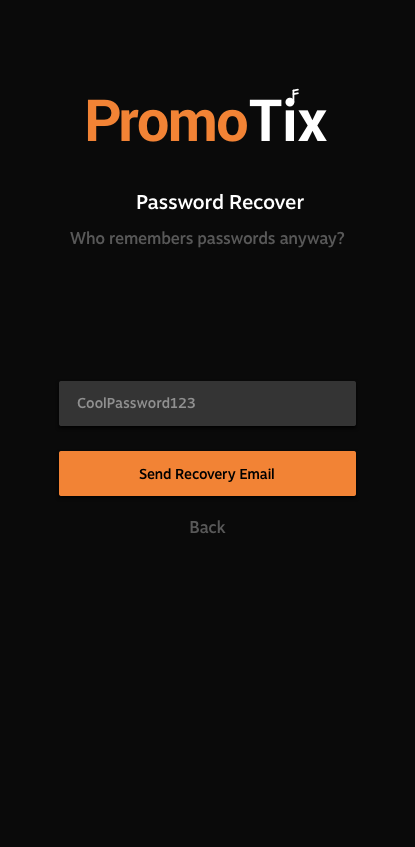
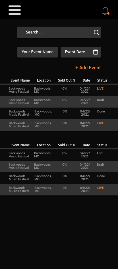
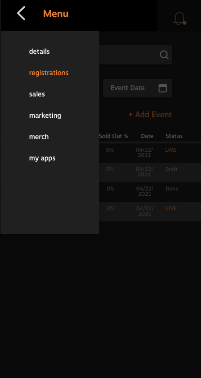
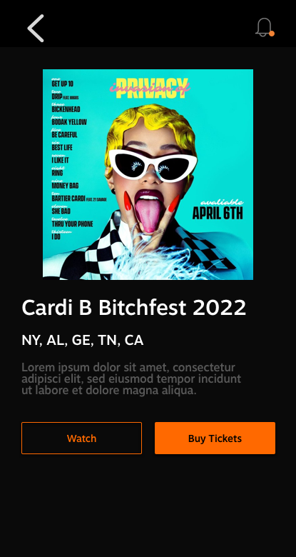
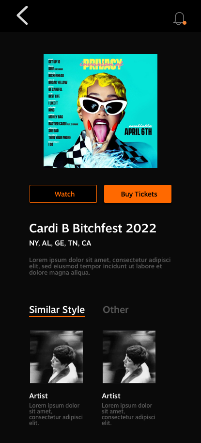
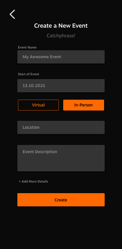
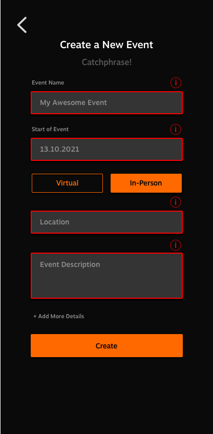


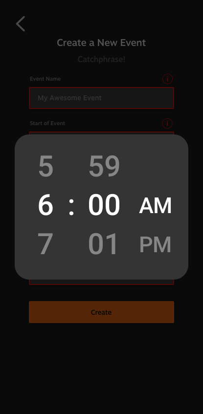
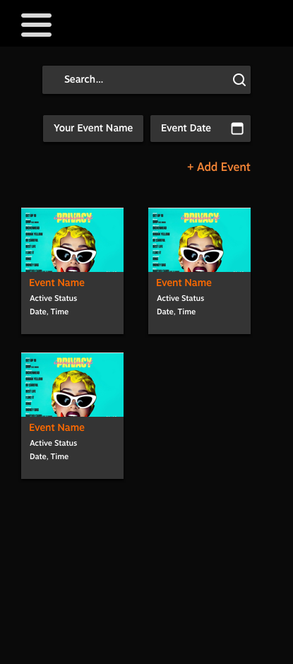

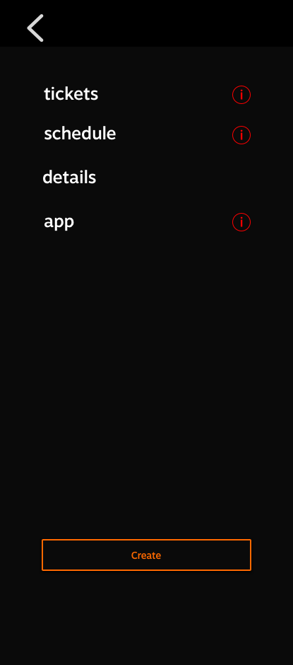
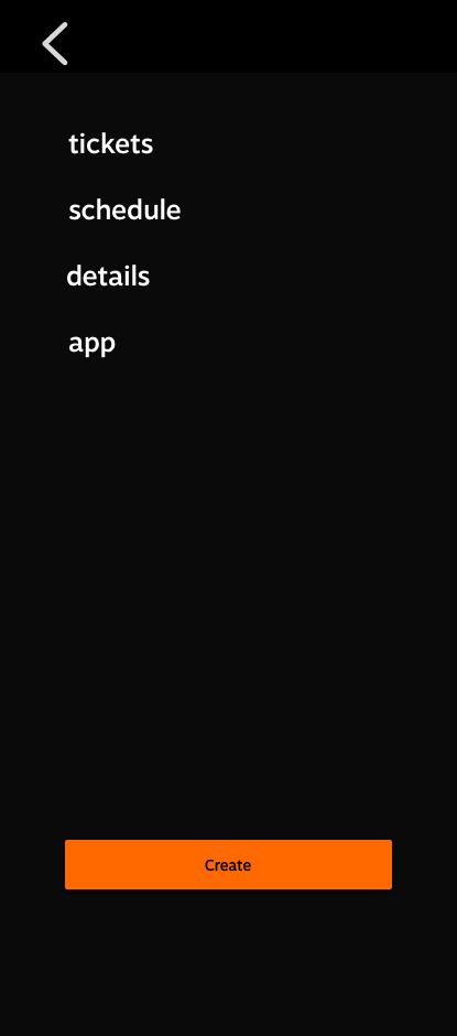
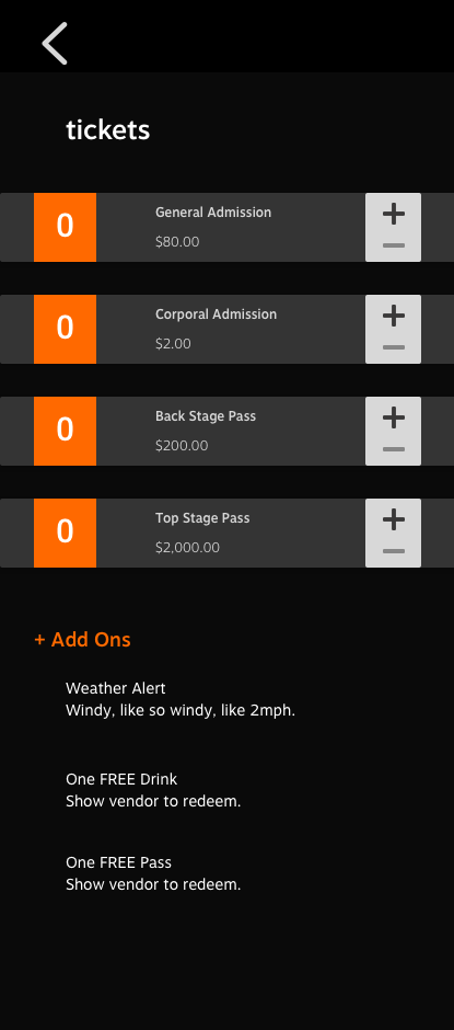

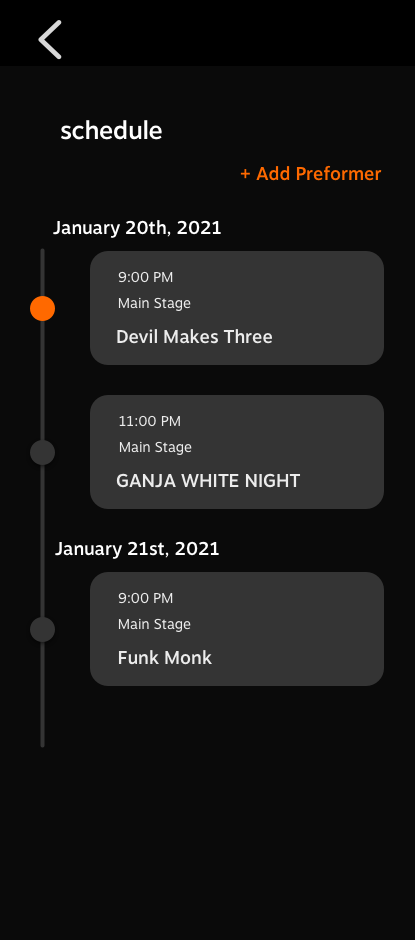
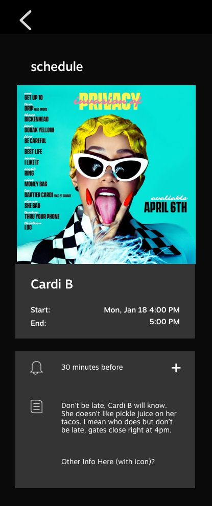
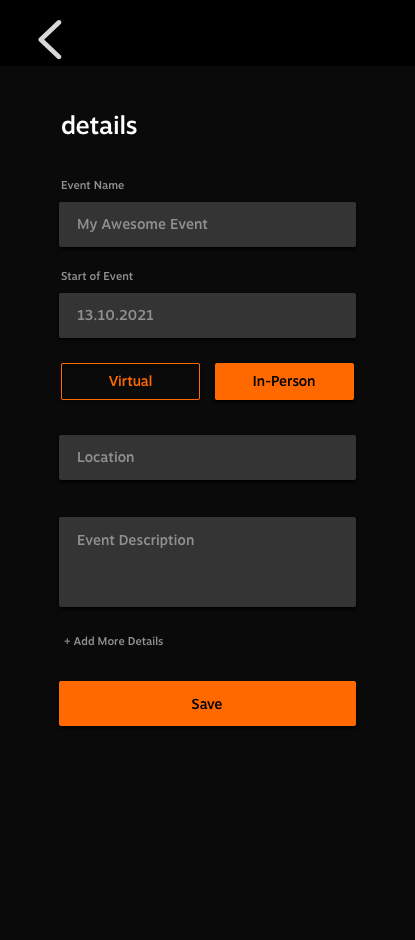

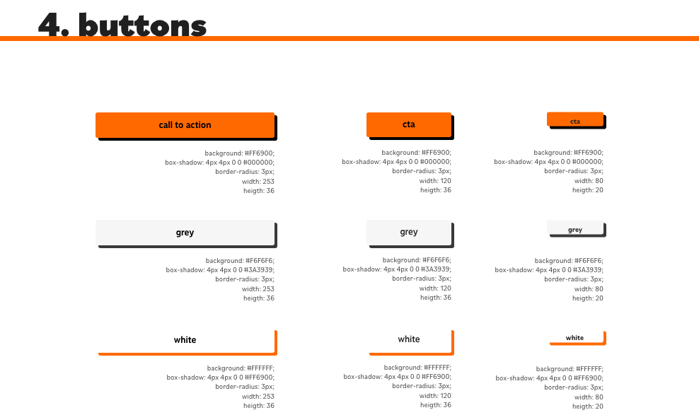
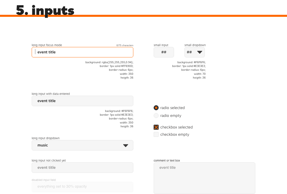
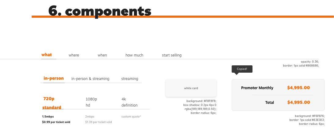
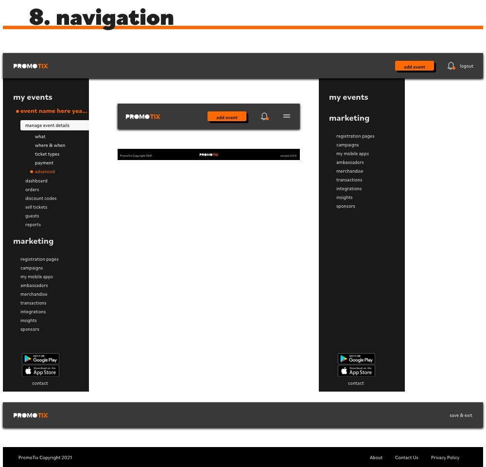
After working out the framework and establishing a more effective experience within the app, we moved onto creating the high-fidelity screens using the updated UI kit created by the Senior Product Designer.
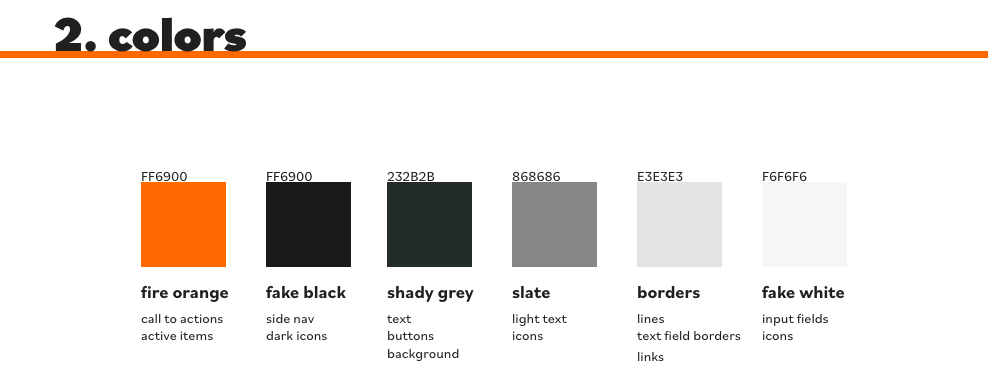
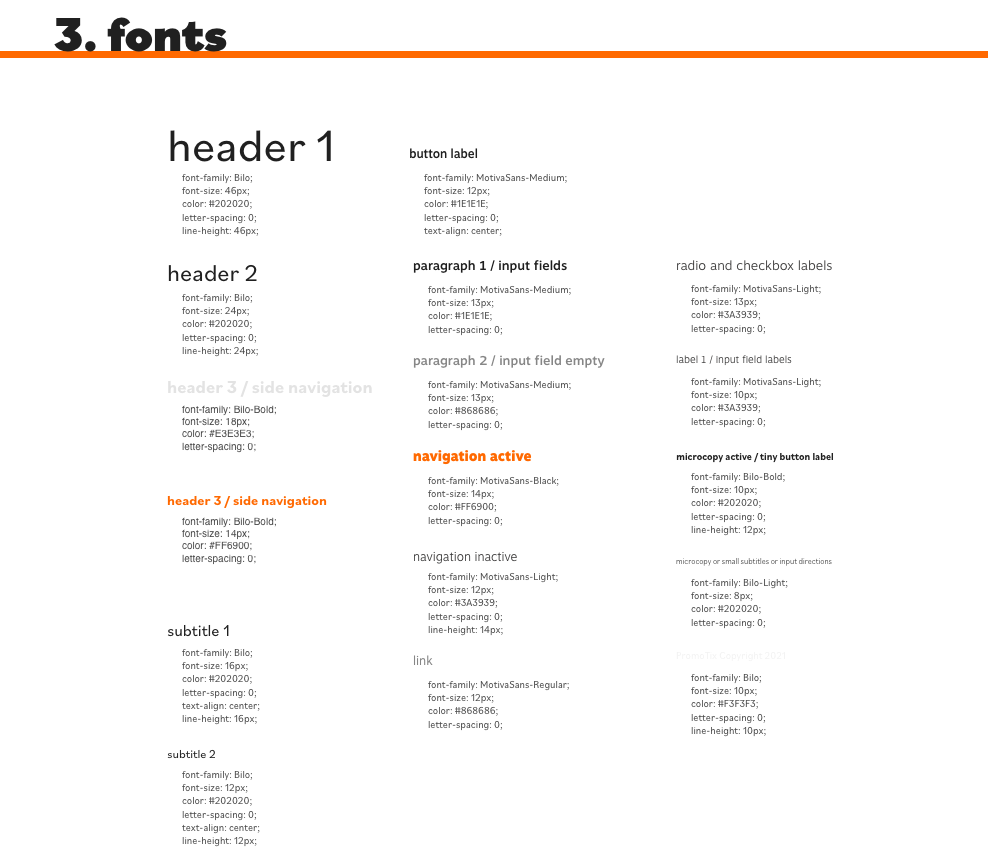

Final Mobile Screen Designs - Custom Mobile App
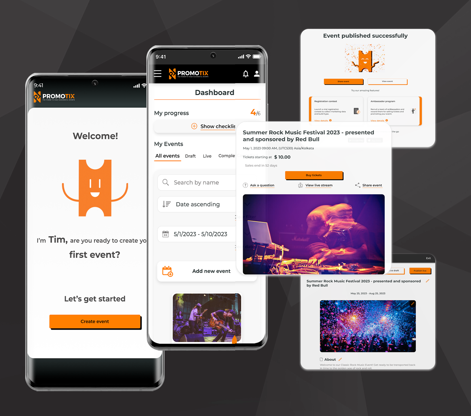
Collaborating with the Senior Product Designer and team, these are the final screens being used, in particular, for the custom mobile app that Event Organizers can make.
Collaborating with the Senior Product Designer and team, these are the final screens being used, in particular, for the custom mobile app that Event Organizers can make.
Animation Examples
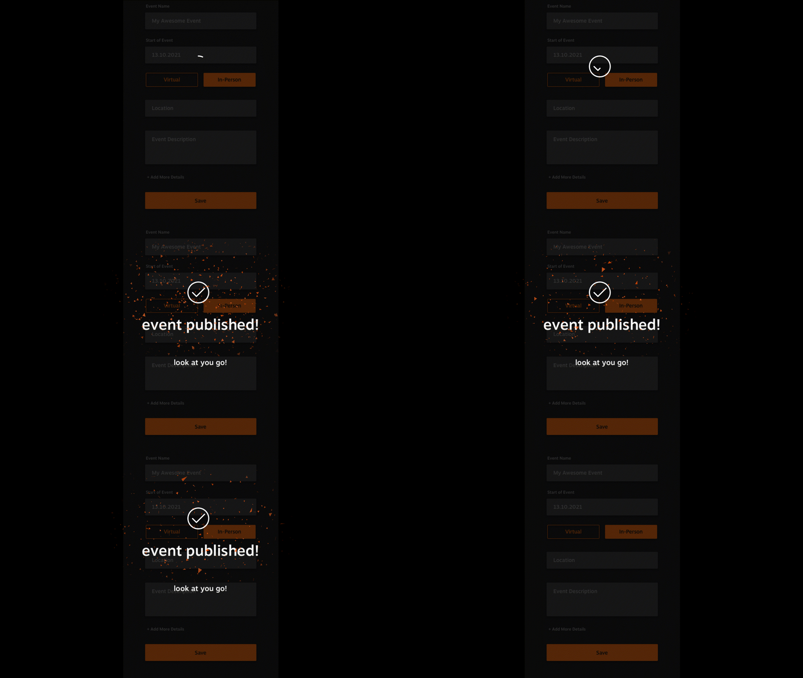
As part of the brand revamp, the team discussed the different screens and elements in the suit that will need to be included in the redesign. I was tasked with creating animations for the application suite. The goal of adding an animation are:
As part of the brand revamp, the team discussed the different screens and elements in the suit that will need to be included in the redesign. I was tasked with creating animations for the application suite. The goal of adding an animation are:
• Moving graphics can elicit joy, anticipation, and excitement the moment users open the site
• Create a sense of loyalty and strengthen consumers' attachment to PromoTix brand
• Take the boredom out of a loading screen
• Create a sense of loyalty and strengthen consumers' attachment to PromoTix brand
• Take the boredom out of a loading screen
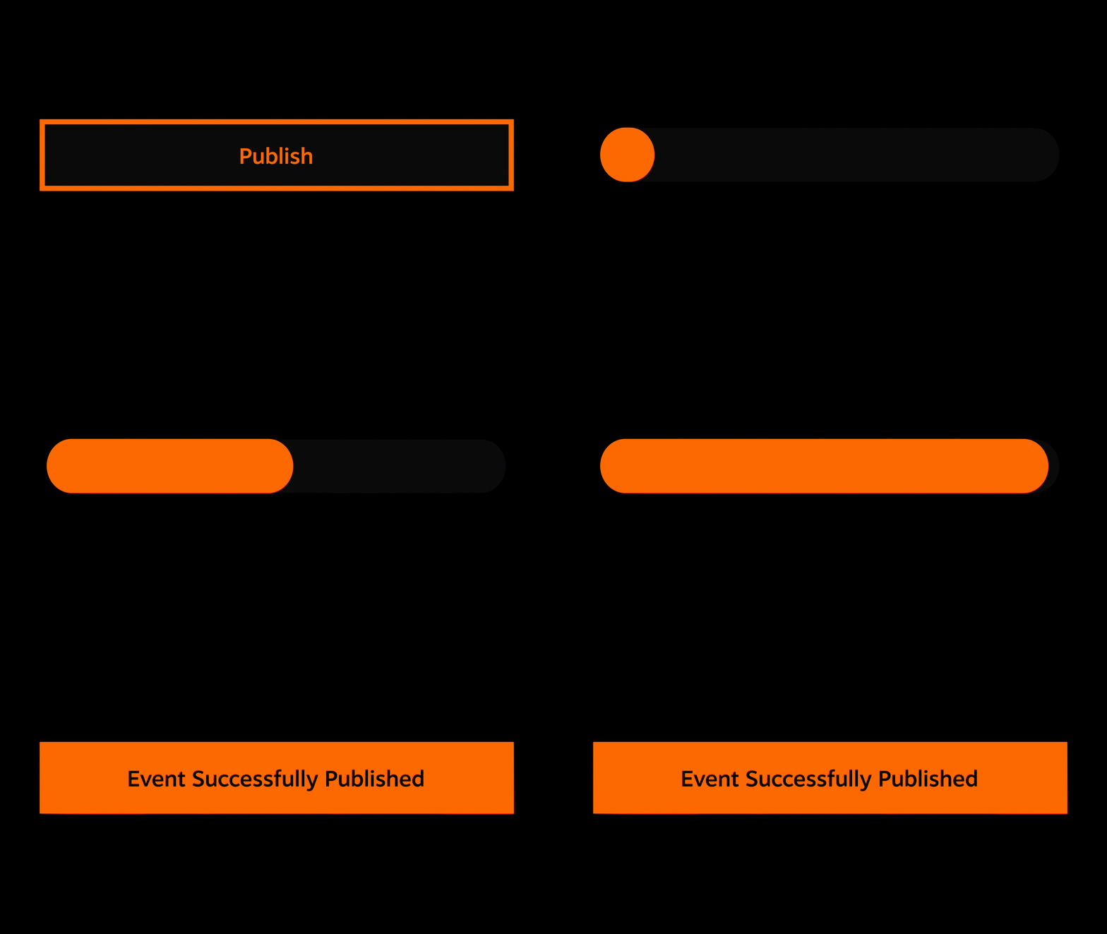
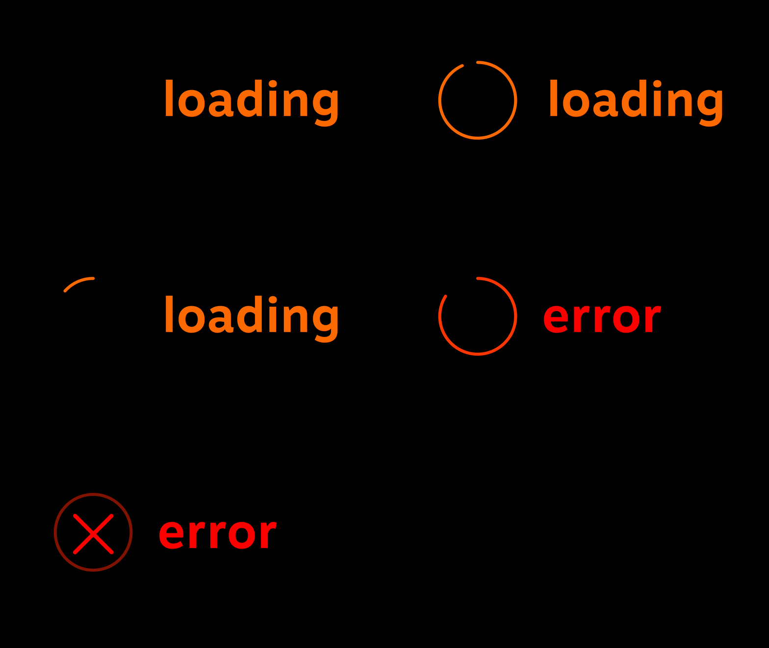
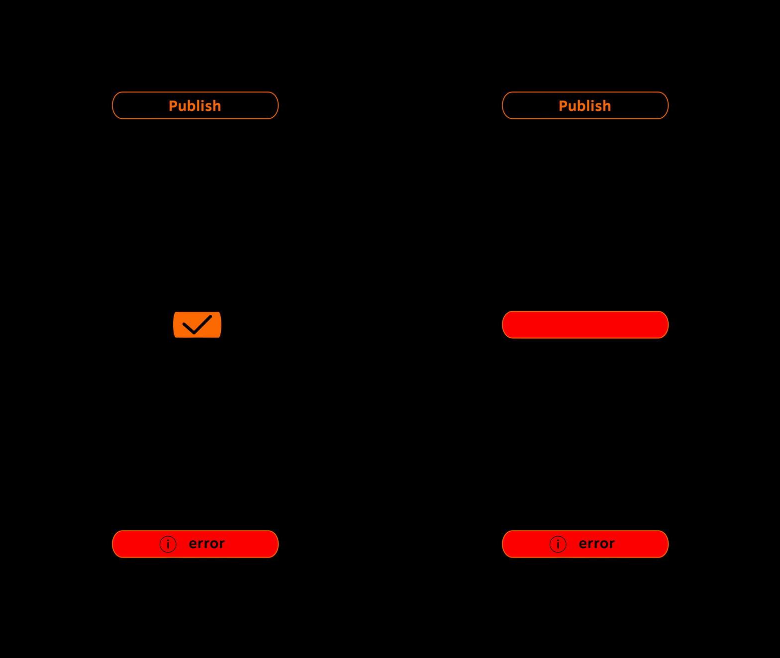
With this in mind, my first renditions for the loading animation were simple and direct. The goal was to show the team what direction we could go in.

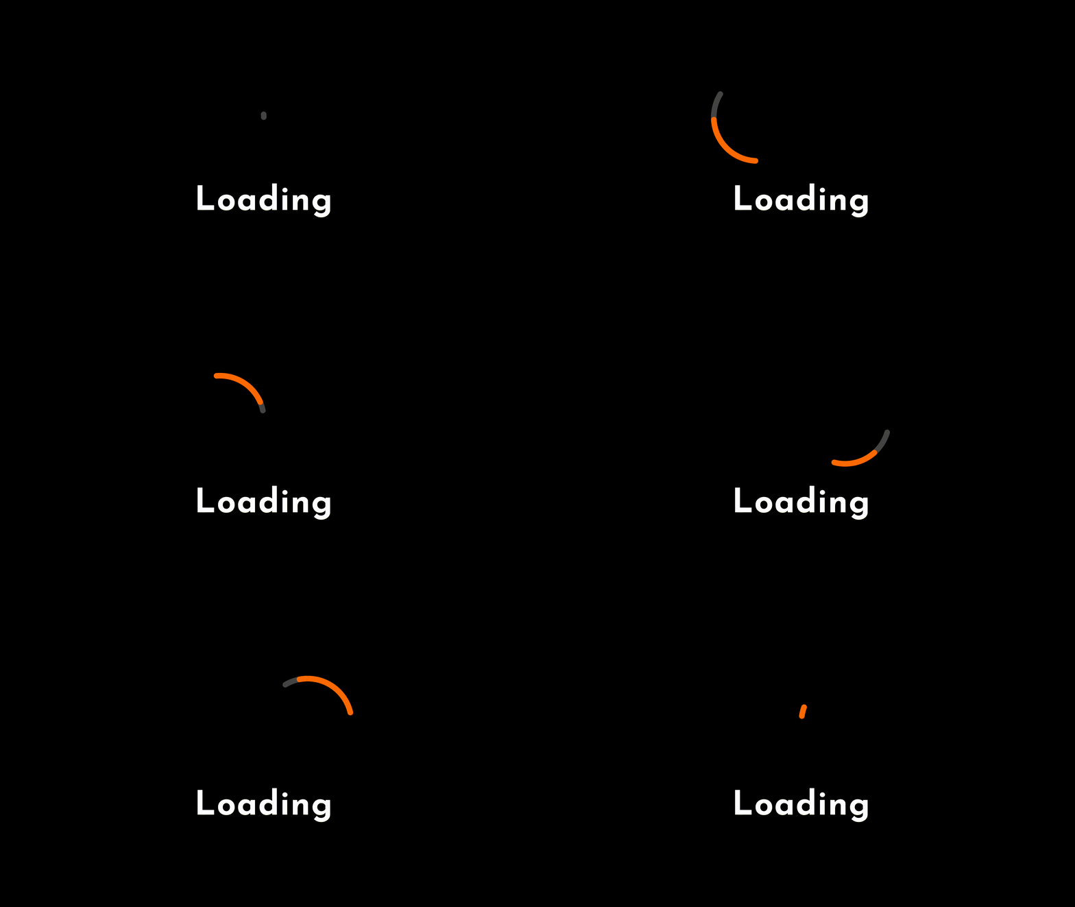
Final Product for Loading Animation
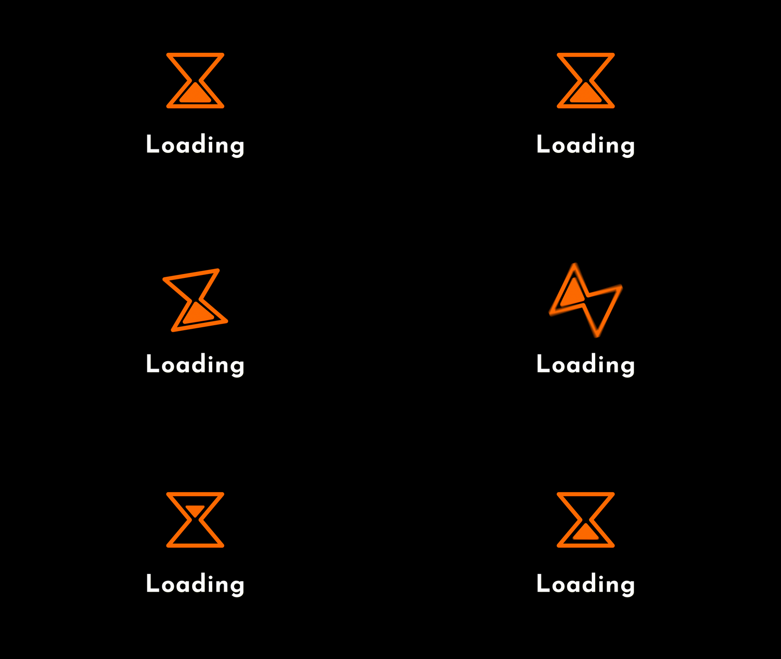
However, the team acknowledges that the previous animations created didn't have much of an identity and, “needed more personality”. So with that in mind, I brainstormed some more ideas and eventually lead to our final product:
However, the team acknowledges that the previous animations created didn't have much of an identity and, “needed more personality”. So with that in mind, I brainstormed some more ideas and eventually lead to our final product:
The team went hysterical, one of the designers said, "That's incredibly cute! I'm a big fan, this would leave a great impression on users!". The Head of Growth mentioned, "It has more charm and it's more fun! The loader has the personality that I was hoping for!".
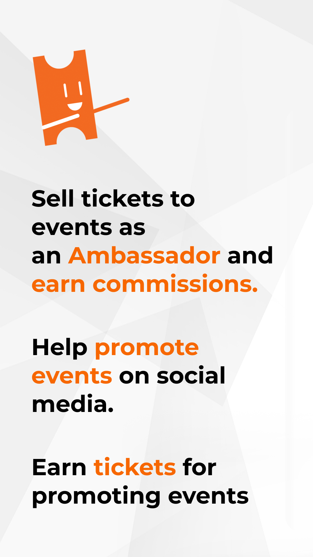
I named him Tim. The team calls him, "PromoTim".
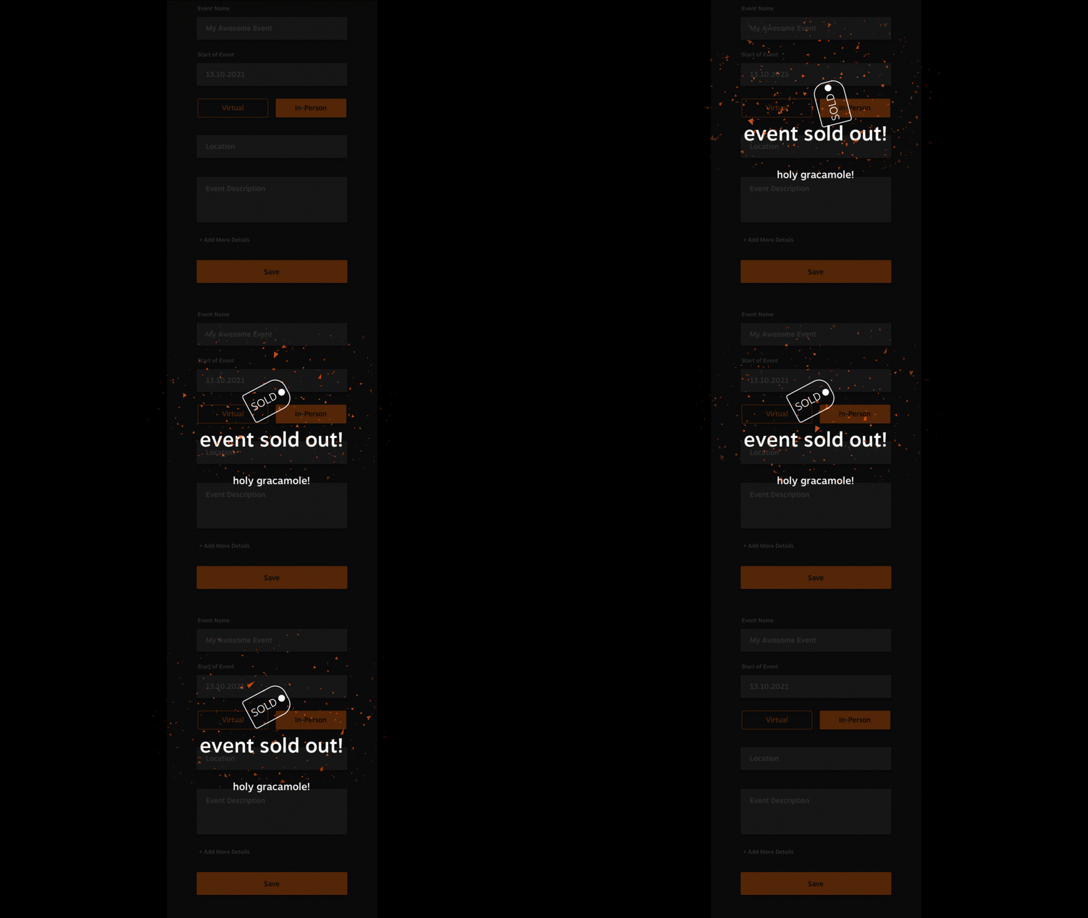
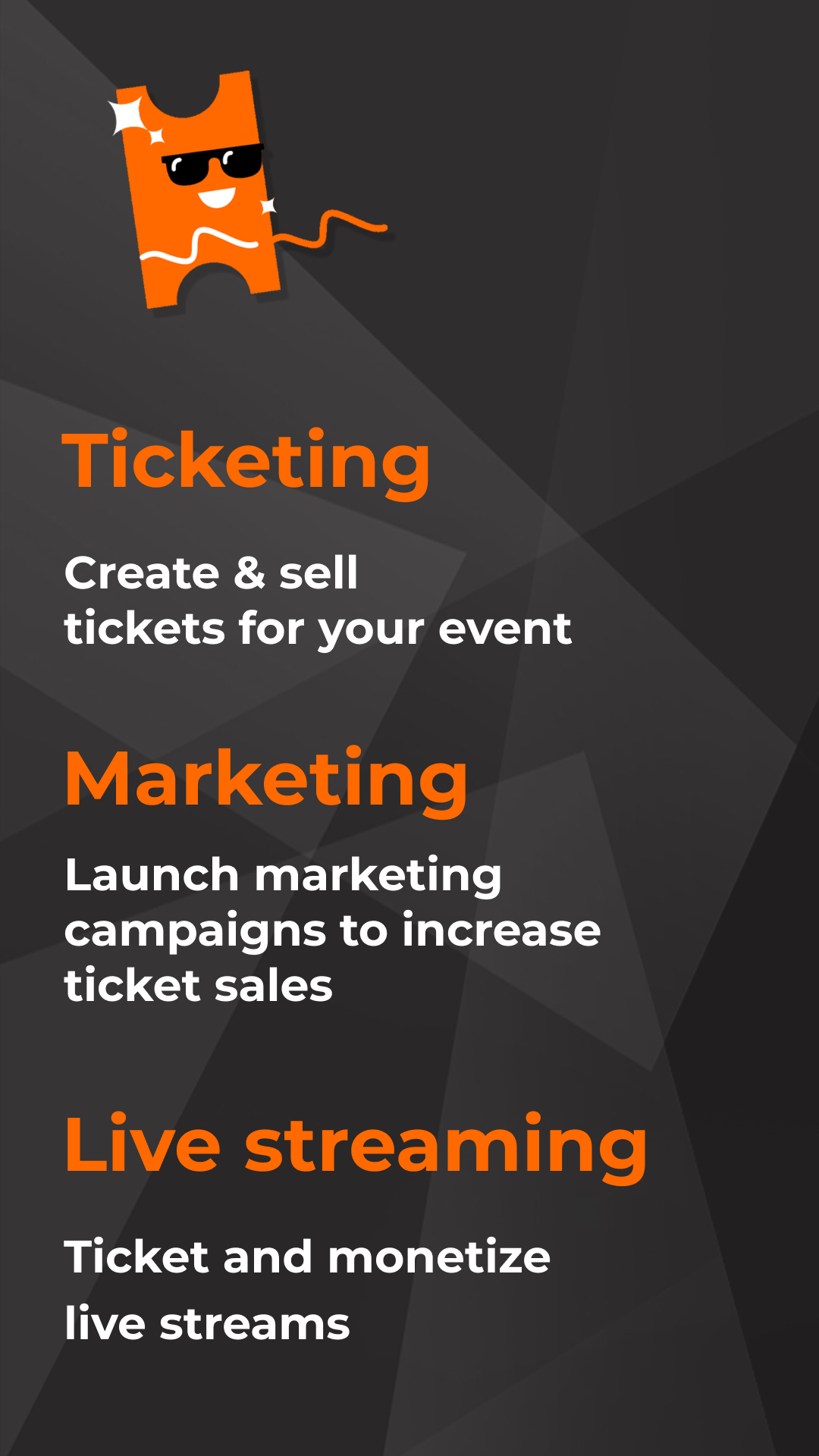
PromoTim is primarily used as the loading screen and as the celebratory animation. He is also seen in some of the other marketing material and quickly became a part of a branding tool.
Pricing Plans and Packages
Continuing down the timeline of the PromoTix revamp was updating the package plans an Event Organizer can upgrade to. The original design was, "boring, not interesting...this could be causing an issue with revenue...and also no one is adding on a mobile app to their plans" VP of Technology mentioned.
Continuing down the timeline of the PromoTix revamp was updating the package plans an Event Organizer can upgrade to. The original design was, "boring, not interesting...this could be causing an issue with revenue...and also no one is adding on a mobile app to their plans" VP of Technology mentioned.
The objective here was to update it with the new UI kit but also include all info contained in each package, fixing user flow when purchasing, and being able to compare plans and pricing. After doing a bit of research as to why PromoTix’s Pricing Plans and Packages were not working effectively, I concluded the following:
Why Users Don't Upgrade
• Natural Intertia- it's easier to do nothing and leave things as they are rather than make changes
• Can't see value in upgrading - the possibility is business didn't do a good job of demonstrating the value to users
• Users feel they're getting everything they need from the tier they're on already
Why Users Upgrade
• Upgrade provides users with core functions
• Users want more functions open up to them - free versions are enough to demonstrate the value of what the next tier can have for users
• Upgrade makes life more convenient
• Upgrade makes a business look good
• Upgrade provides users with core functions
• Users want more functions open up to them - free versions are enough to demonstrate the value of what the next tier can have for users
• Upgrade makes life more convenient
• Upgrade makes a business look good
How to Prompt Users to Upgrade
• Users need to understand the features available
• Know what to charge for
• Focus on getting people to use the product first
• Focus on educating rather than telling
• Understand their businesses so that your product is mapped to their pain points
• "Upselling isn't about scamming customers, it's about helping them solve their problems"
• “Don't list features, they don't sell. Benefits do.”
• When to offer to upsell - during the checkout process, during the ongoing email marketing campaign, and in-app when a user reaches a critical point
• Ask for feedback about the product and Keep an eye out for user complaints
• Monitor customer behavior - what features are most popular? how do you users actually use the product?
Problem with this Screen:
• Users are not adding mobile app to plan
• Team expressed packages are visually dull
• Difficult to compare plans and view current plan
• Too many steps to complete purchase
• Package/plan info needed better organization
• Users are not adding mobile app to plan
• Team expressed packages are visually dull
• Difficult to compare plans and view current plan
• Too many steps to complete purchase
• Package/plan info needed better organization
Solution:
• Updated visuals with UI kit and Design System
• Added section for features included in all plans
• When logged in, can compare current plan with upgraded packages
• Reduced steps in purchasing process (thus keeping user in purchasing mindset)
• Organized info to show high point features and can expand for more info
Pricing Plans and Packages - Mobile Screen Designs
I wanted to include mobile screen designs in addition to the web screens.
I wanted to include mobile screen designs in addition to the web screens.


Checkout
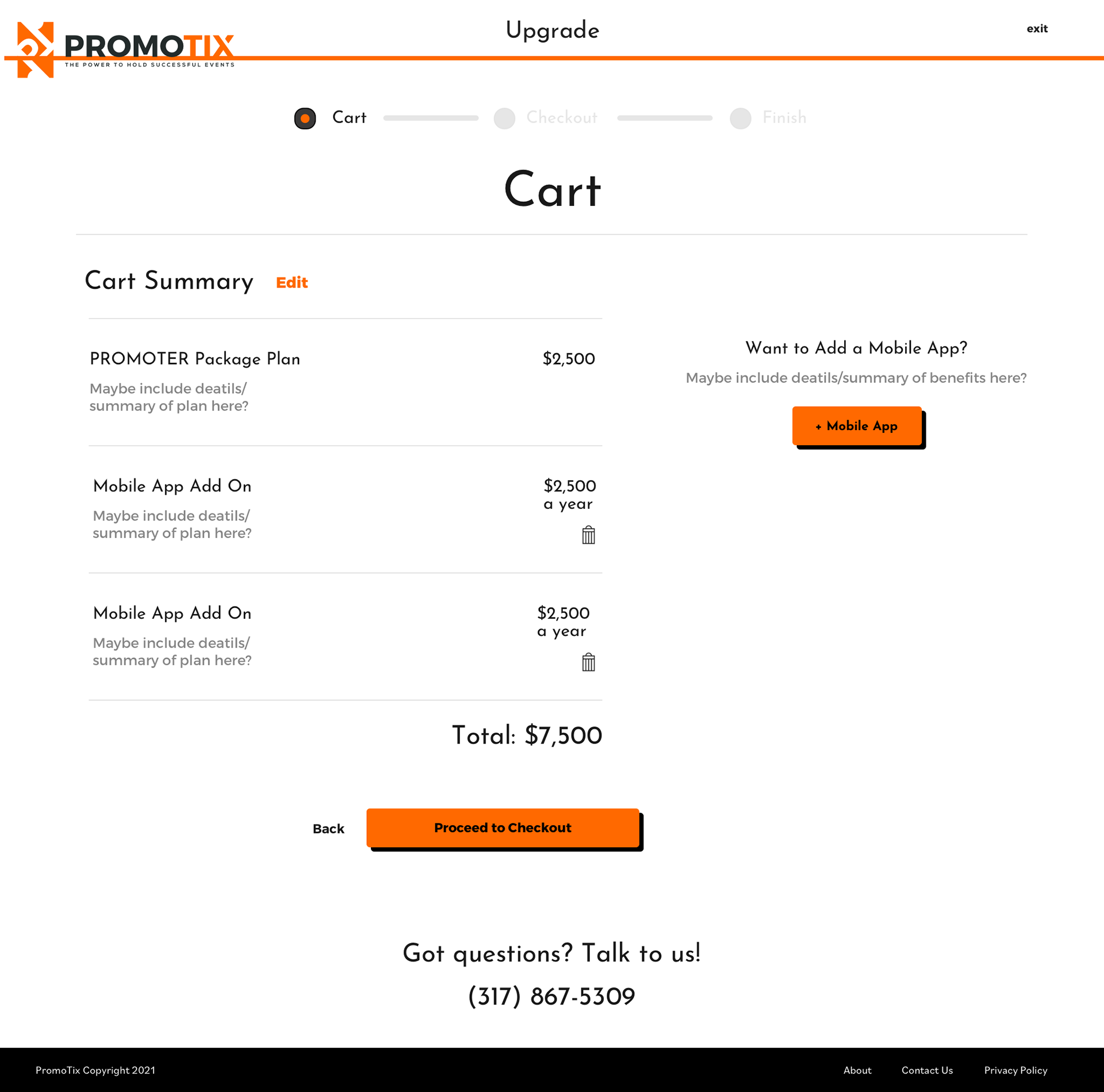
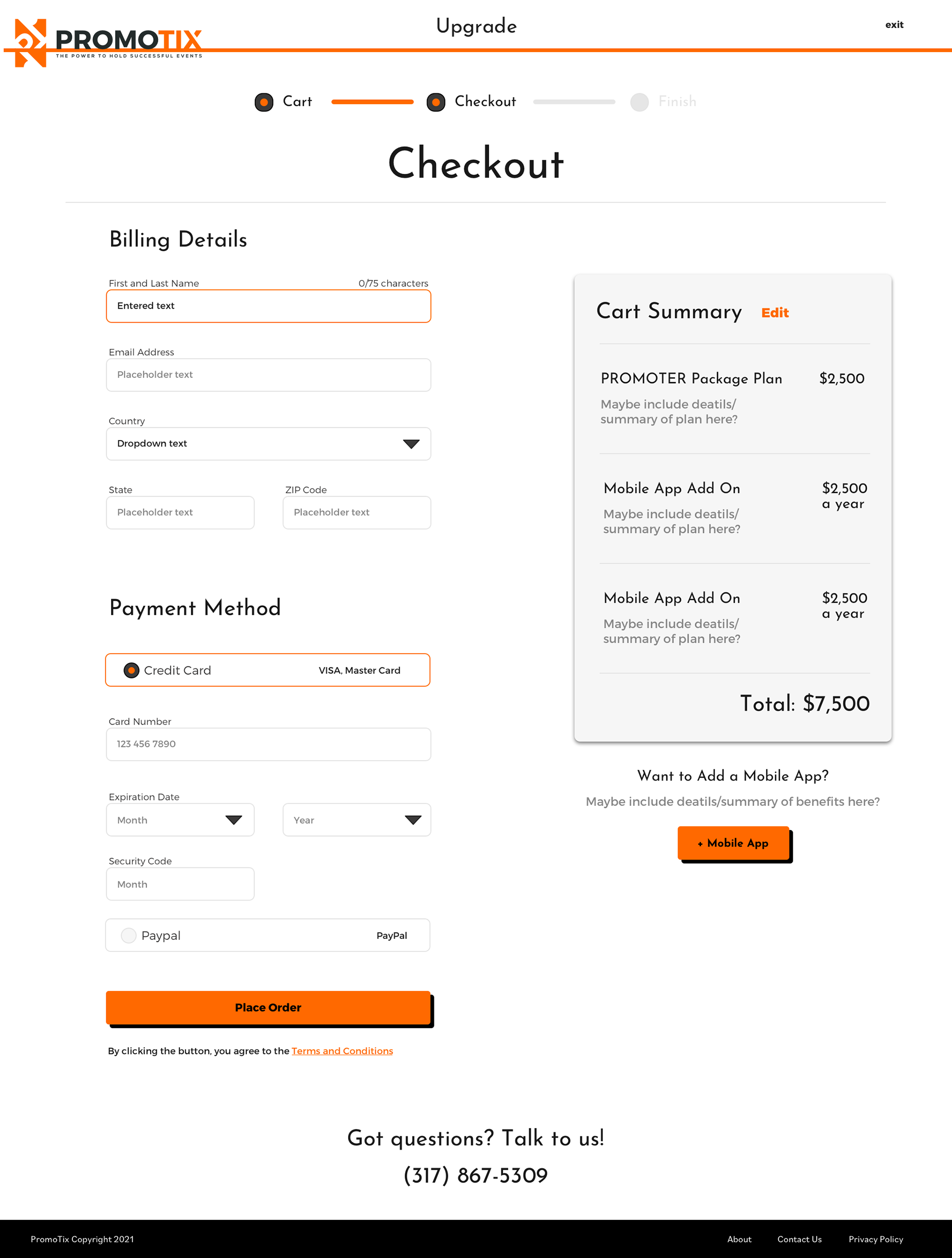
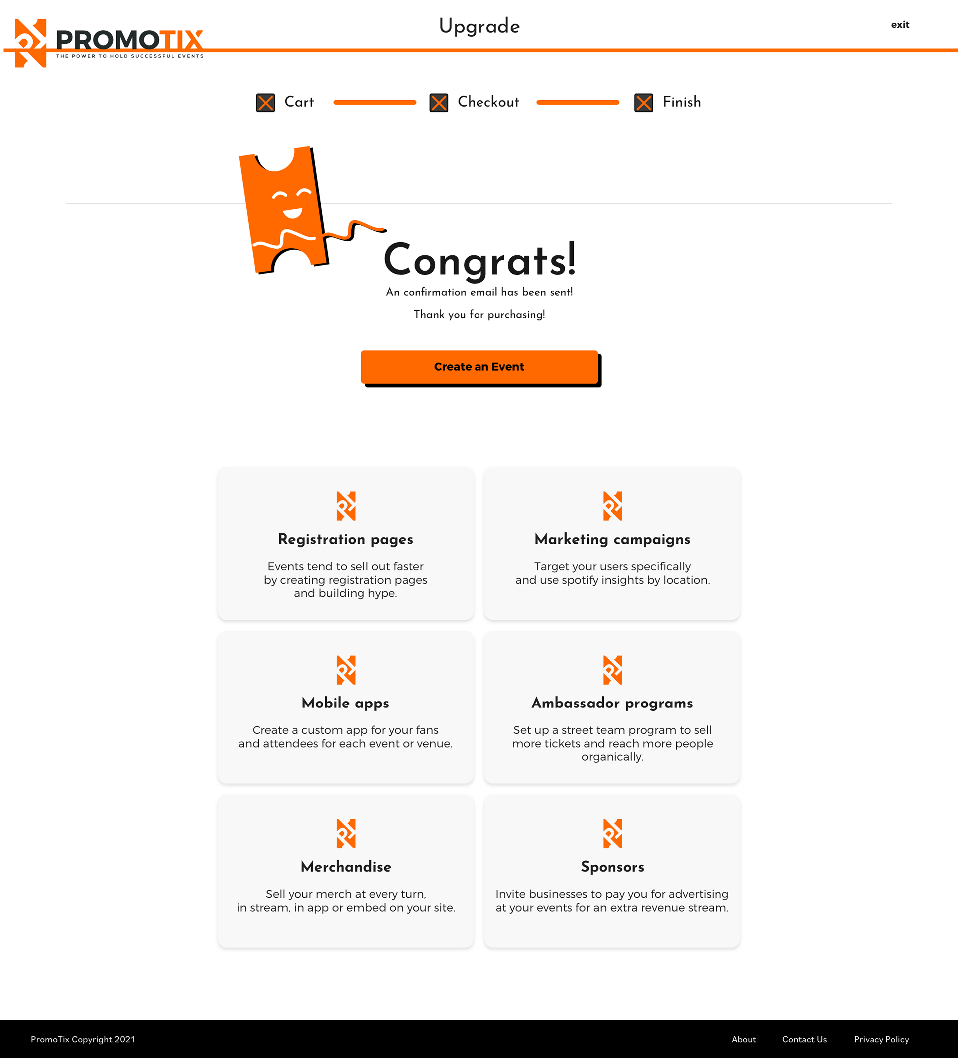
As part of the solution to some of the pain points mentioned previously, I added a segment of the checkout that includes a "Add a Mobile App" button. I reduced some of the steps in the user flow of the checkout as well in order to keep the "purchasing mindset" within users.
As part of the solution to some of the pain points mentioned previously, I added a segment of the checkout that includes a "Add a Mobile App" button. I reduced some of the steps in the user flow of the checkout as well in order to keep the "purchasing mindset" within users.
