Company
TEC Systems is the largest privately owned independent Building Automation and System Integration Contractor in the New York Metropolitan area, creating custom designs state-of-the-art control solutions to the most challenging of building automation needs. They also offer initial system design, engineering, commissioning and maintenance, software development, and panel fabrication services.
InGather is a separate branch and product of the company that is more specific towards cannabis growers and agriculturalists.
InGather is a separate branch and product of the company that is more specific towards cannabis growers and agriculturalists.
Challenge
The UX Engineer and Graphics Manager brought me on the project to assist with continuing the work of the previous designer and creating new screens and updating existing screens based on feedback, expanding the UI kit by creating icons, colors, and other graphics, and creating animations.
Team
Team consists of Graphics Manager, UX Engineer, 5 developers, several others on the Technical - Graphics & Programming team, and myself.
Original Designer's Portfolio:
https://jennetcetera.com/
Original Designer's Portfolio:
https://jennetcetera.com/
Model Screens and UI Kit
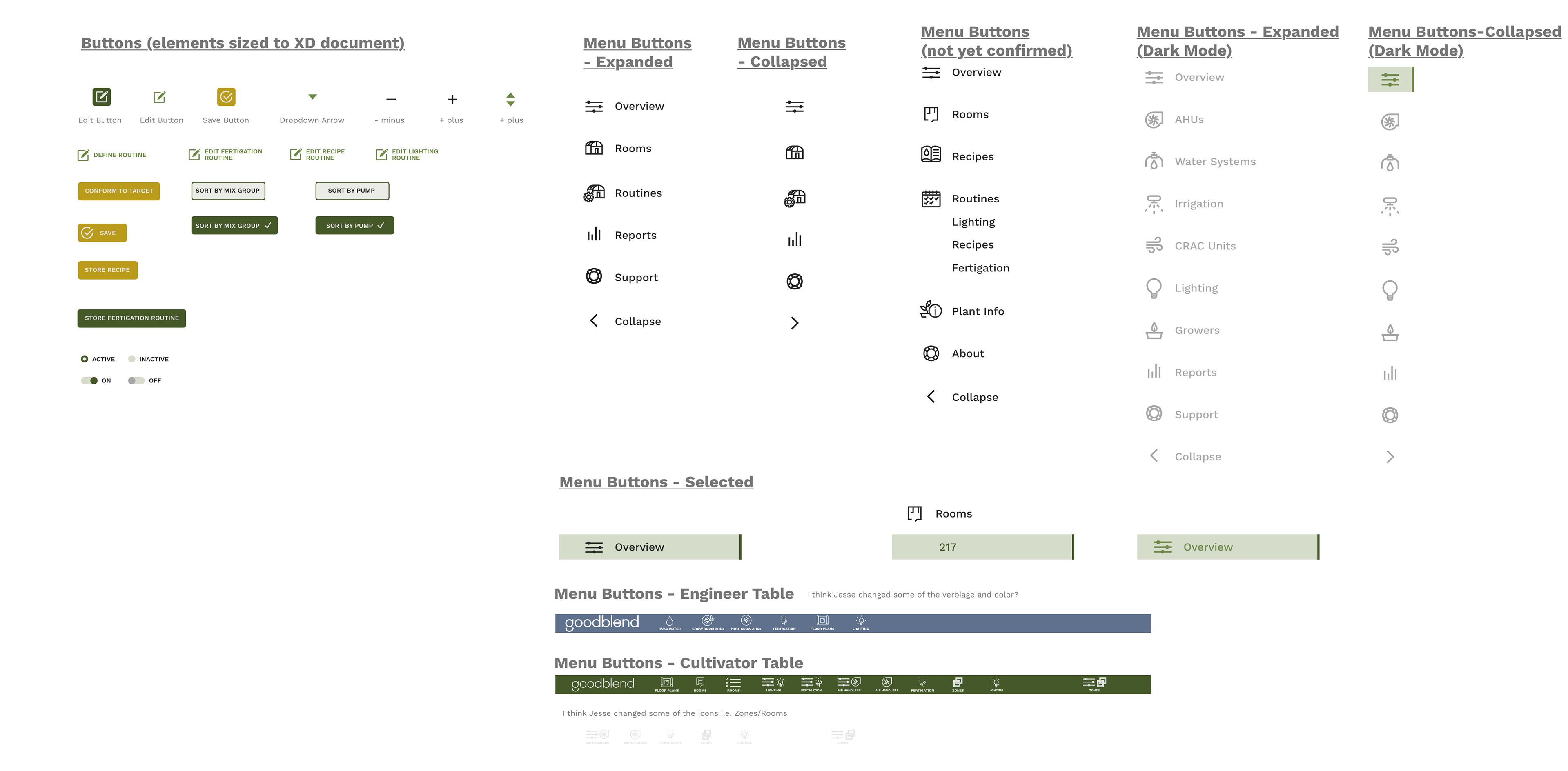
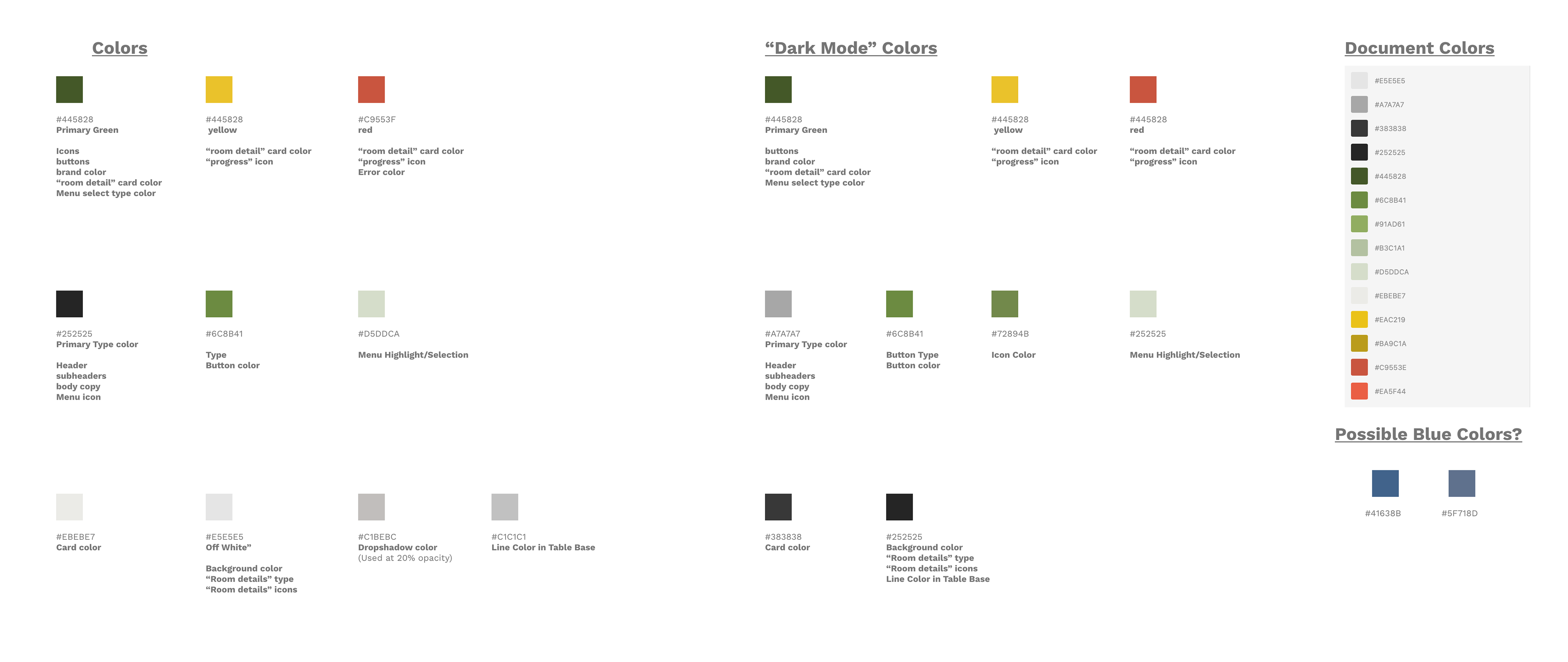
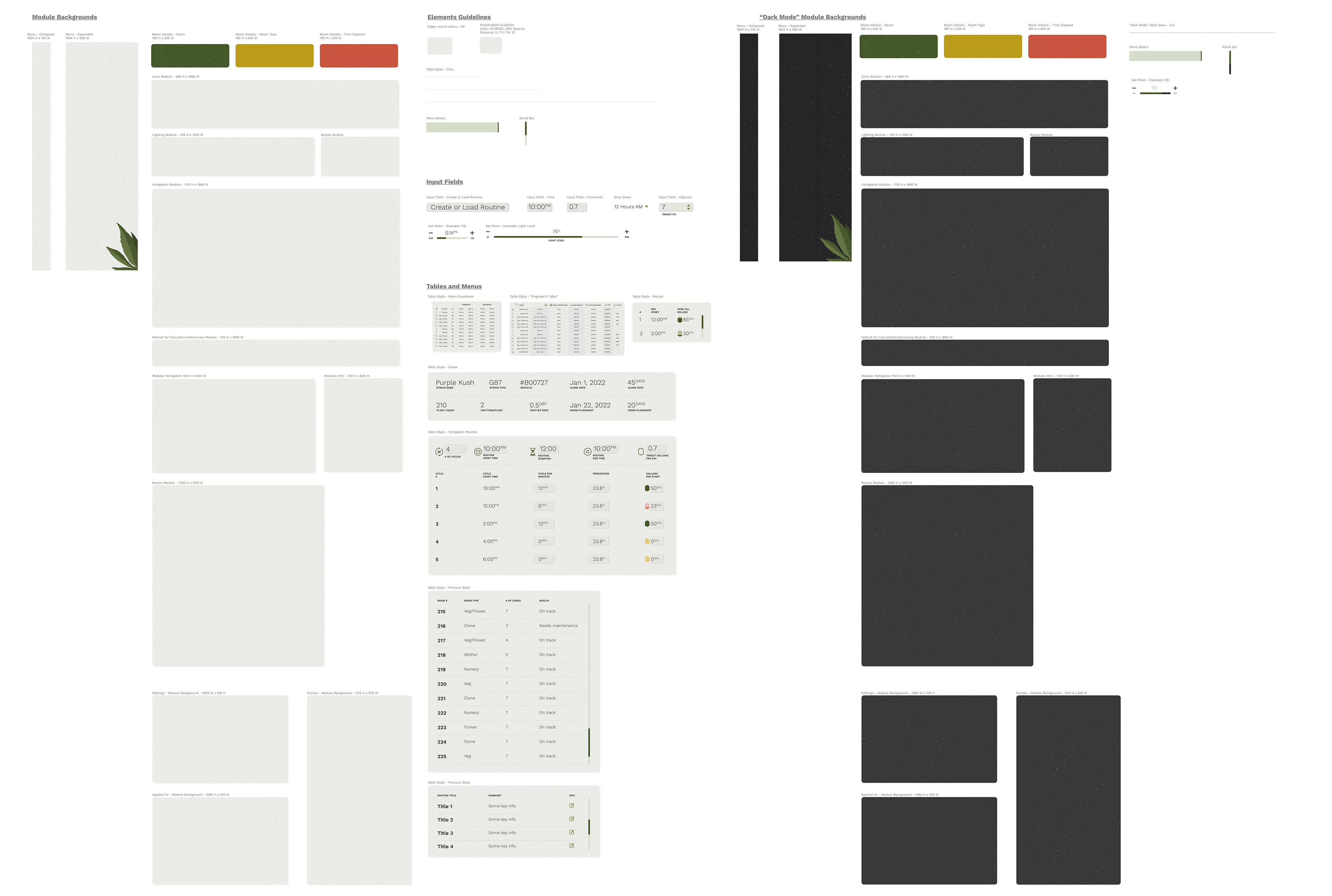
The original Designer set up a model UI composition and layout that I was able to build off of.
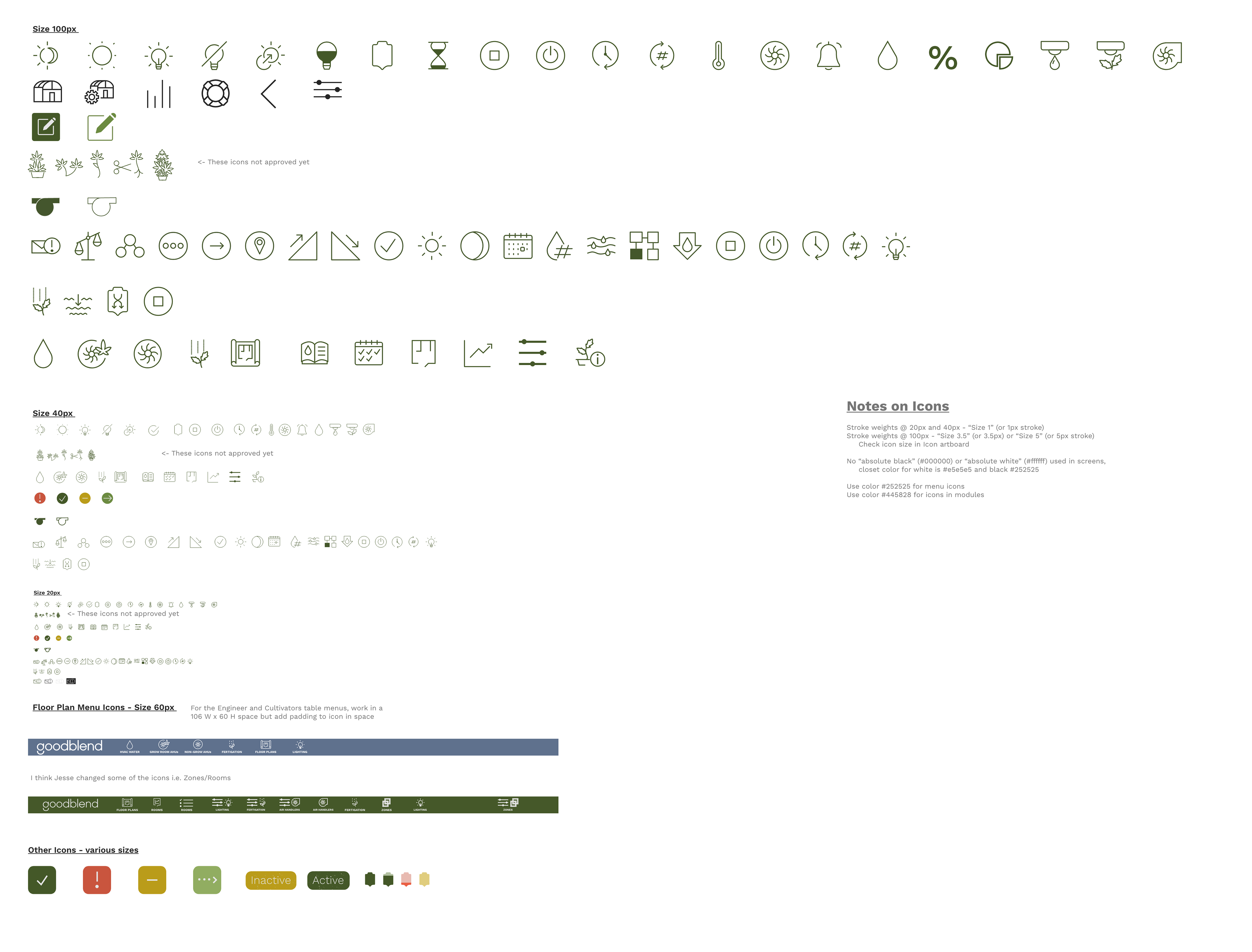
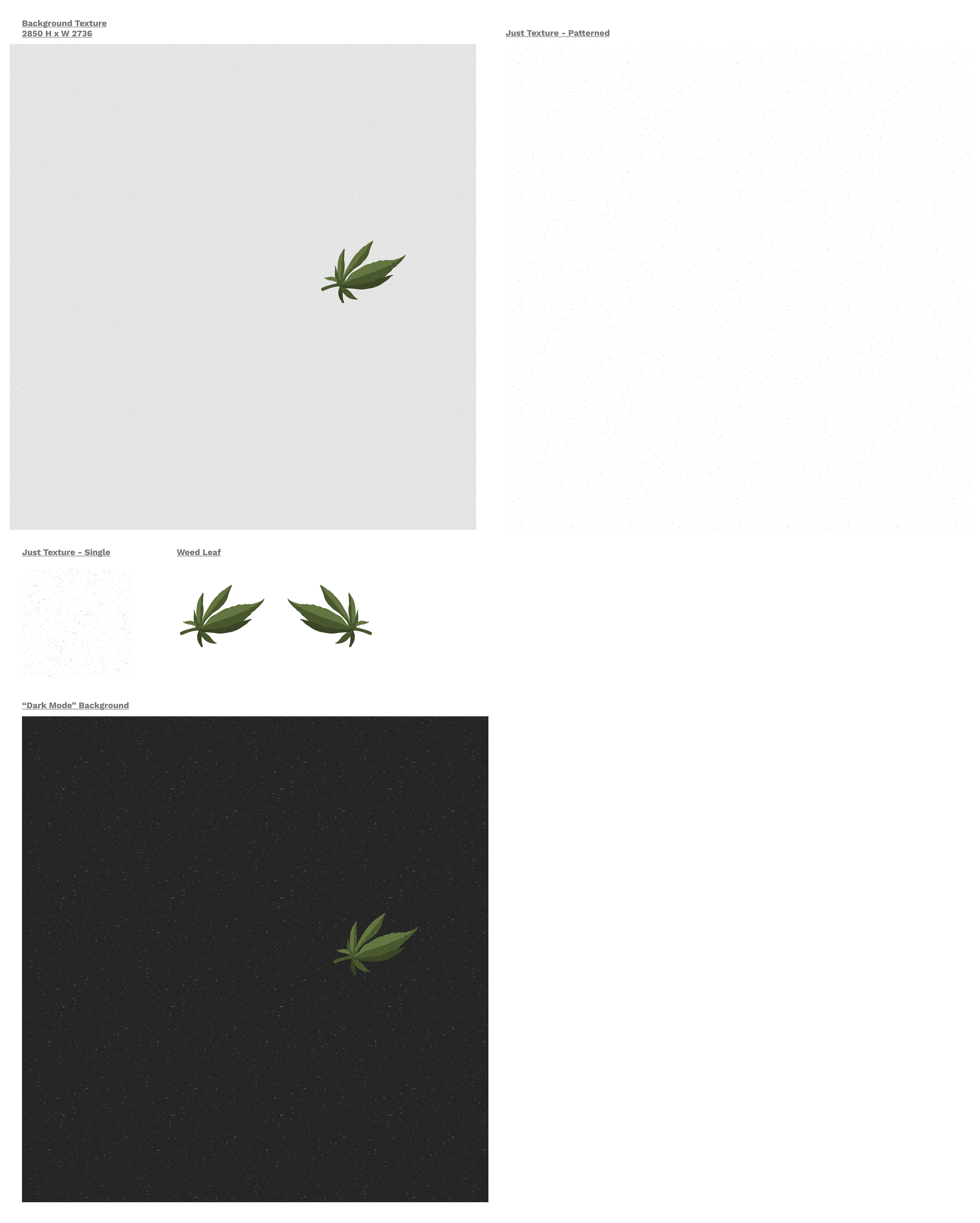
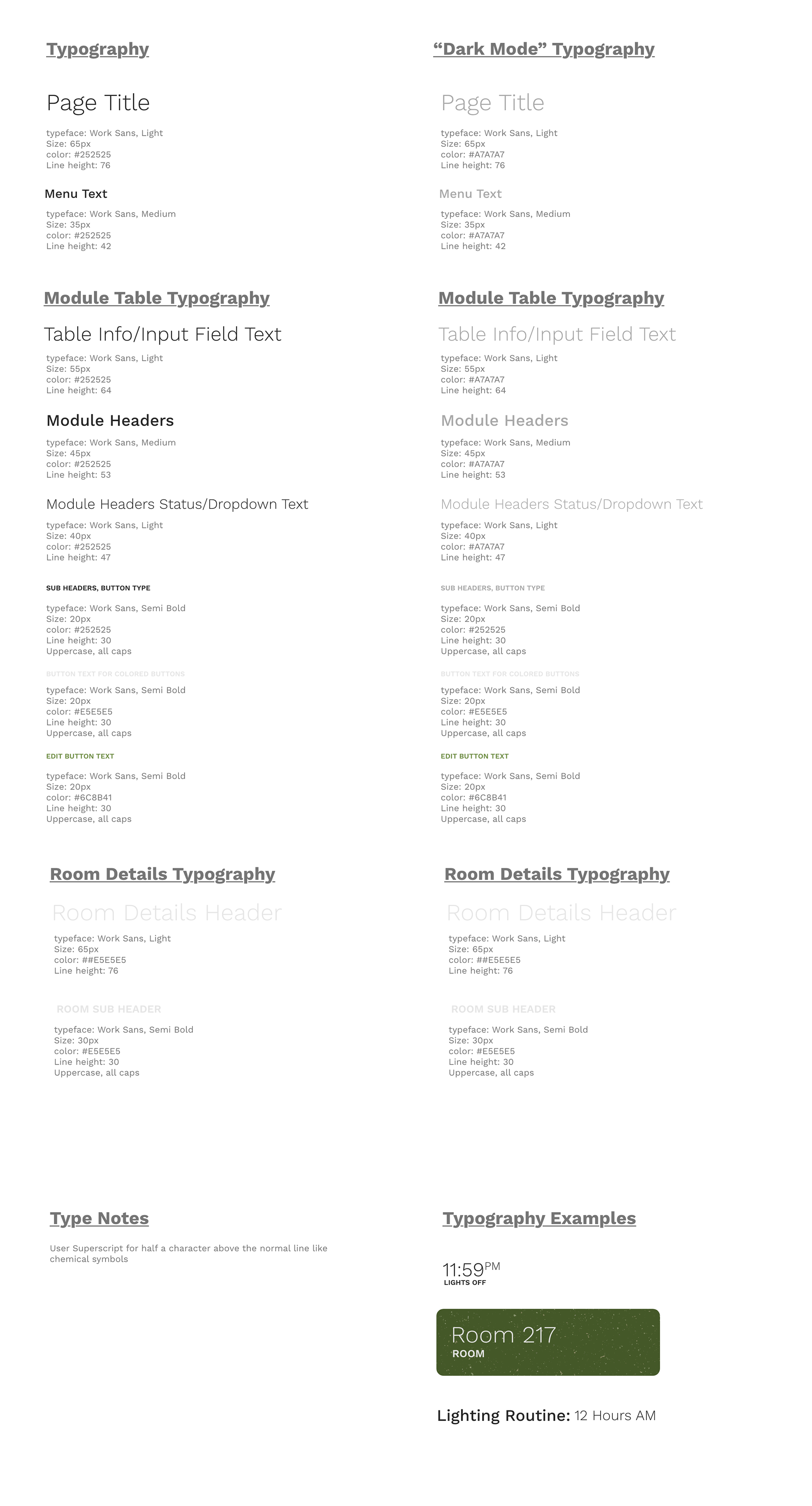
From here, since there wasn't a UI Kit or a Design System established, I was able to set up and even expand on the kit, adding icons, buttons, colors, etc. For me, having a UI Kit sped up the design process, achieve consistency throughout and easily send off to the product development team.
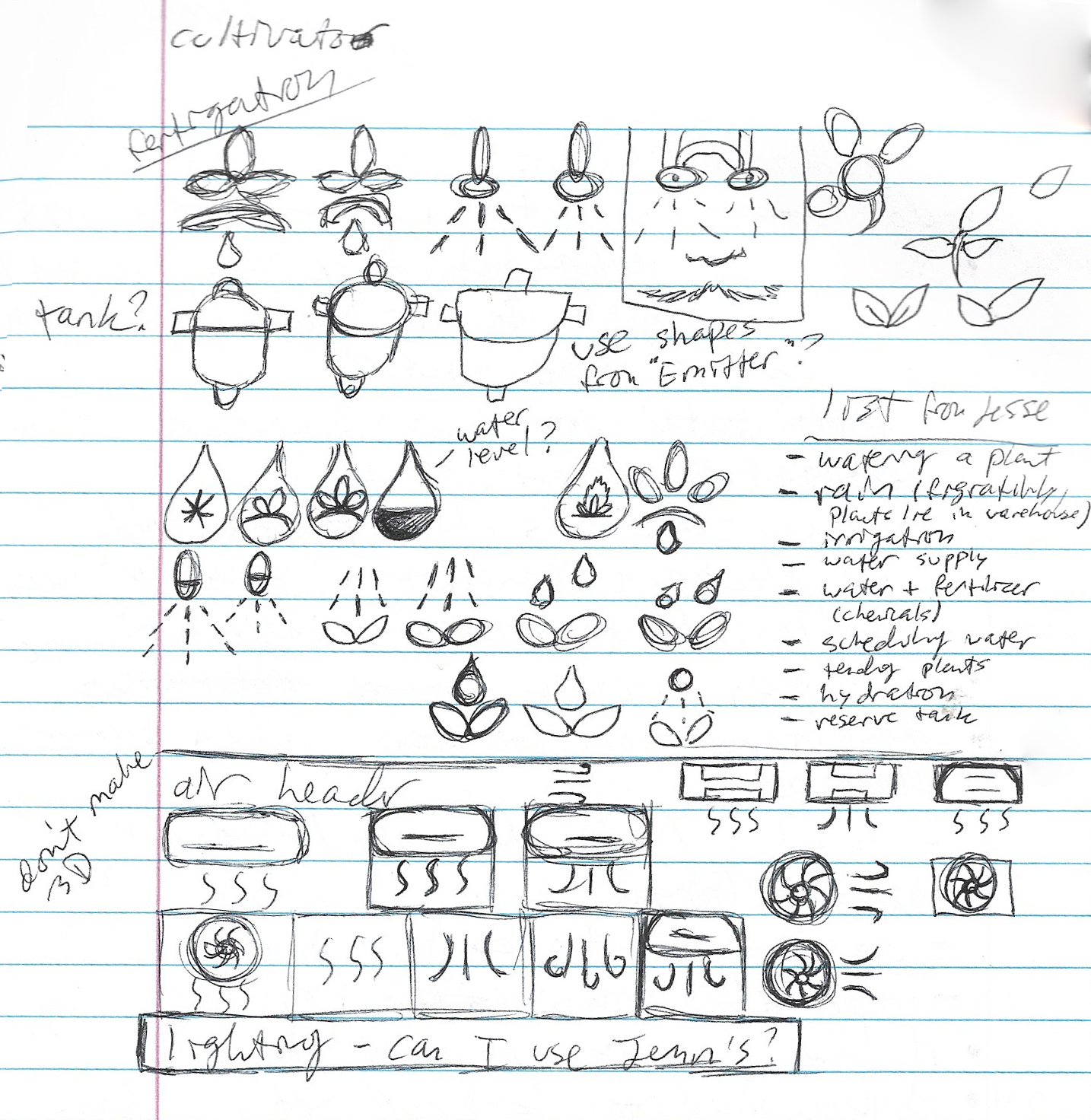
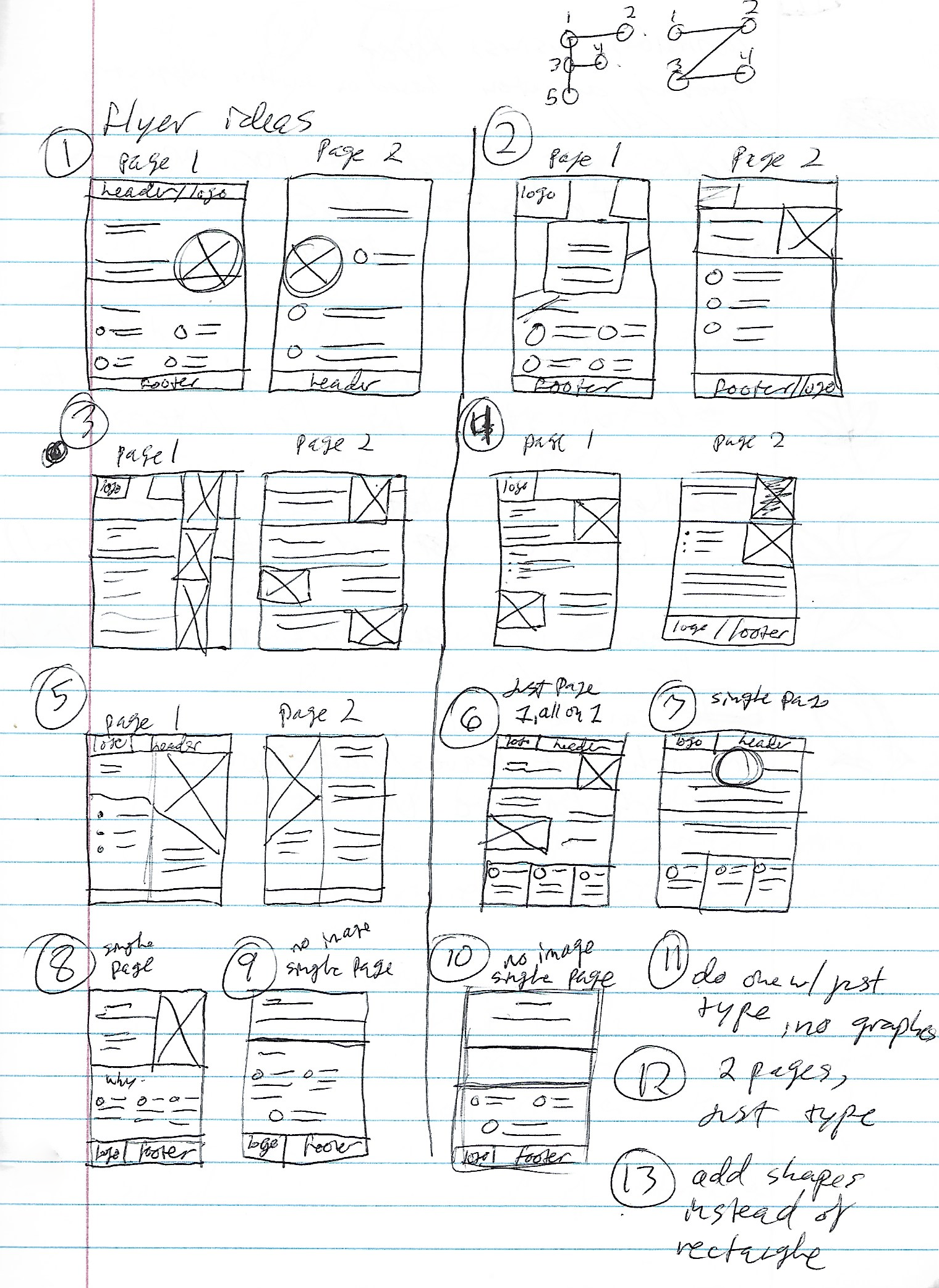
Wireframing and Sketches
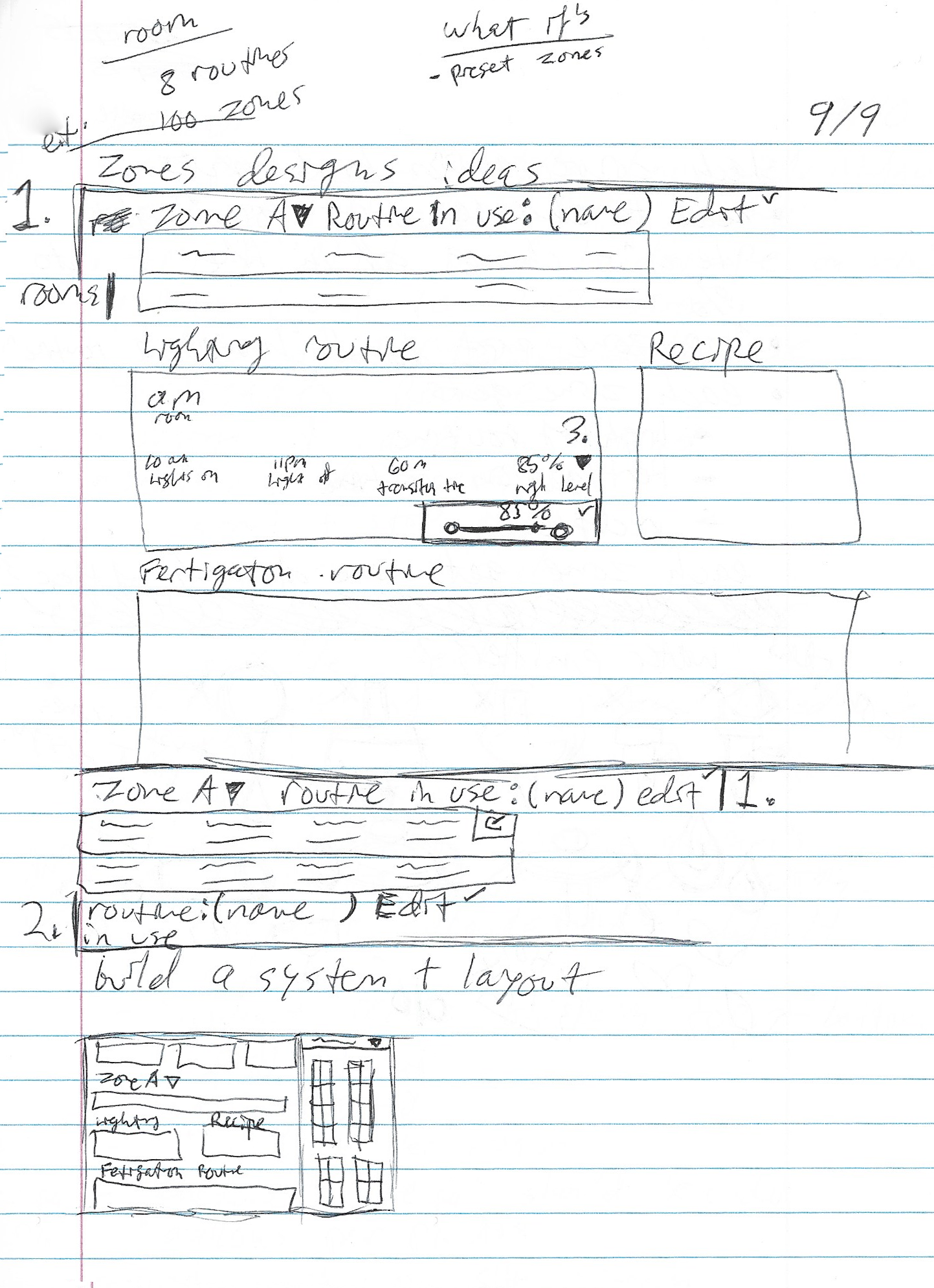
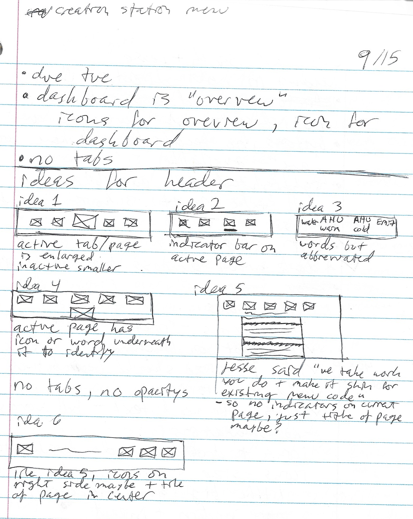
Wireframing is crucial as it helps me plan out the structure, layout, and functionality of the interface. It serves as a blueprint, allowing me to visualize the user flow, hierarchy, and interaction points early in the design process.
Logo Exploration
The team agreed that they wanted a better logo for the InGather branch. The UX Engineer made a statement saying, "I want a leaf either in the tittle of the i or in the g-counter or a-counter". This was such a great idea so I started exploring some options.
Afterward, option 3 was selected but needed to be refined. Here is the final logo:
Grow Room Display Screens
With the fundamentals set up and the initial idea created, I continued to build out the screens while working closely with the Graphics Manager and UX Engineer as I went.
These screens are displayed outside their corresponding rooms and show important info about the space the plants reside in. Cannabis plants are highly sensitive and require a specific environment to thrive in so these screens are essential for plant growth.
These screens are displayed outside their corresponding rooms and show important info about the space the plants reside in. Cannabis plants are highly sensitive and require a specific environment to thrive in so these screens are essential for plant growth.
Previous Designs
• Certain sections were built but not fully established
• Certain sections needed additional info put in
• Needed to add/create more screens
• Icons didn't reflect object/purpose (according to team)
• "ingather" logo needed
• Certain sections were built but not fully established
• Certain sections needed additional info put in
• Needed to add/create more screens
• Icons didn't reflect object/purpose (according to team)
• "ingather" logo needed
New Elements Added
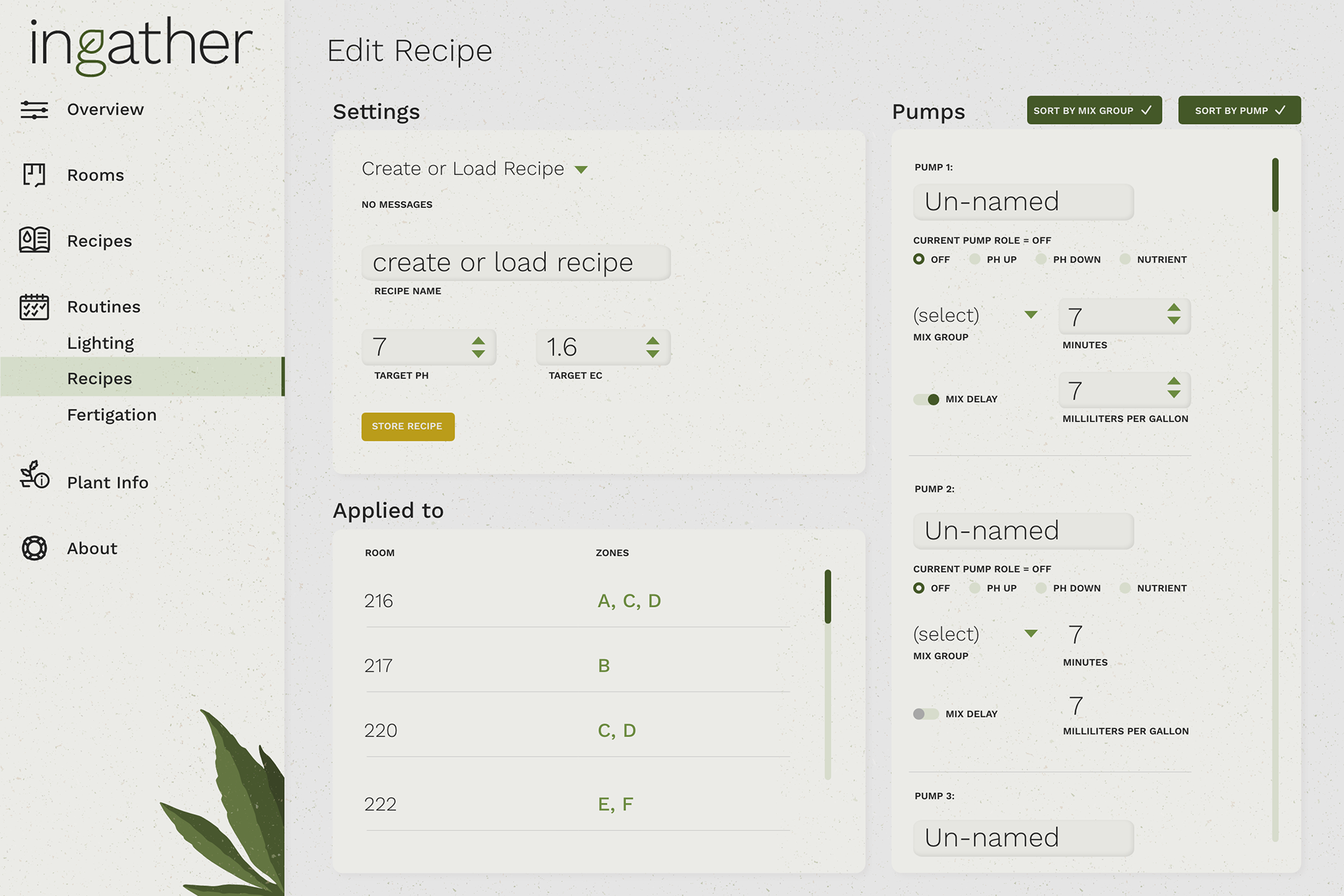
• Established more representation within the settings and pumps sections
• Tasks needing specific info but also not needed
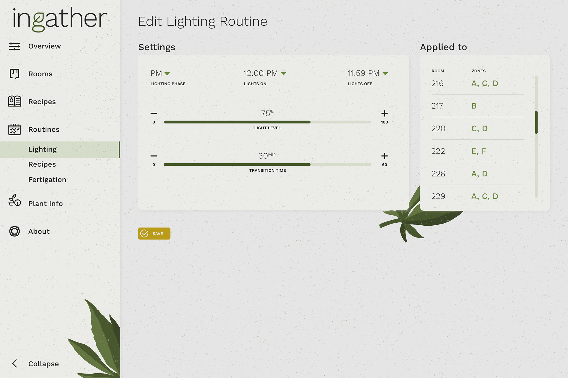
• Added more screens/pages to the product
• Icons were reworked to reflect object/purpose better
• Reformed UX slightly to include Edit buttons, Sort By buttons, etc.
• "ingather" logo created

Cultivator/Engineer Screens
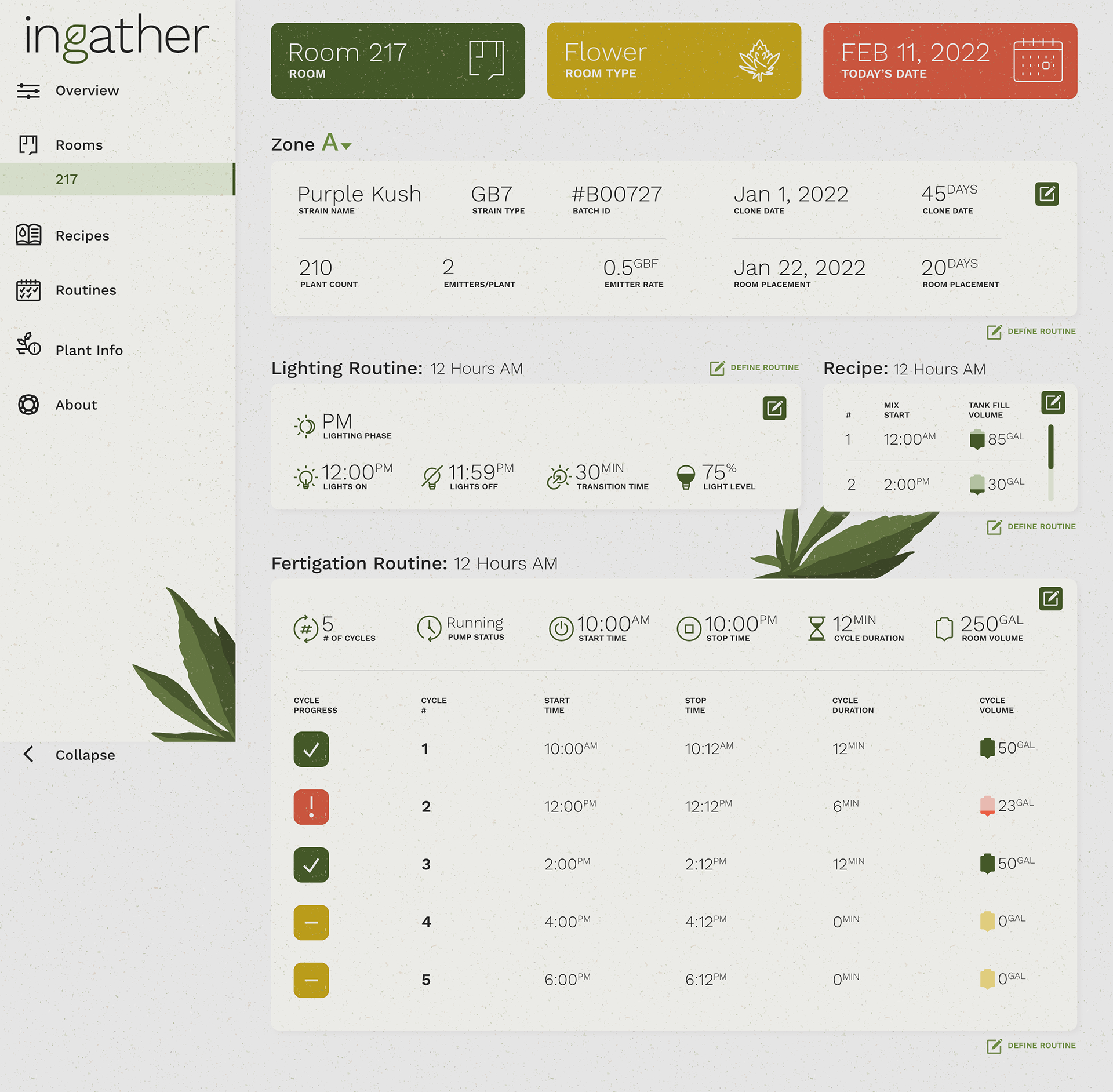
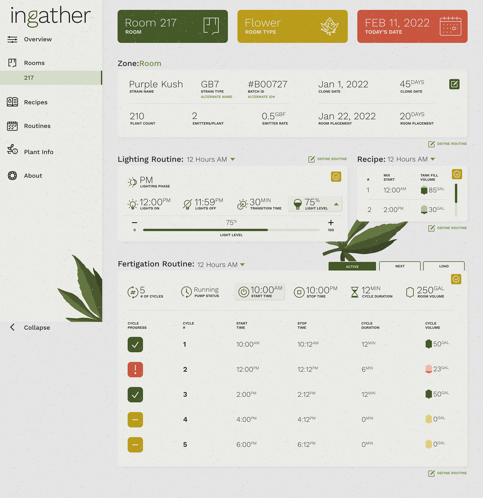
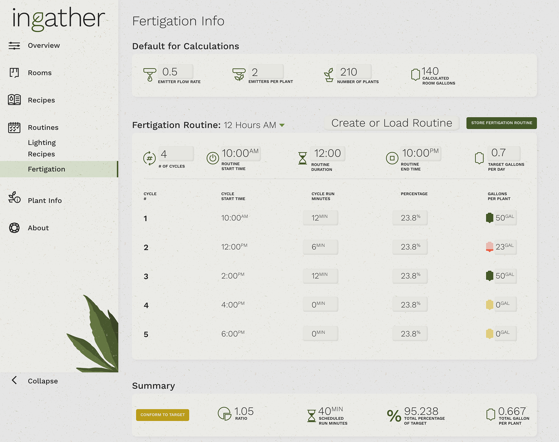
In addition to building the Grow Room display screens, the screens that cultivators and engineers use needed a visual update as well as some slight UX changes. Similar to the Grow Room screens, these screens display room info and data in order to monitor and care for plant growth. However, unlike the Grow Room displays, these screens allow the cultivator/engineer to make adjustments as needed.
Certain elements within the layout are not eligible for a redesign since it's based on Honeywell's programming, a majority of the large product equipment proposed, sold, and installed by TEC Systems. Even though I couldn't make the necessary changes because of this, I was still able to visually improve the layout and data tables compared to the previous design being used.
Certain elements within the layout are not eligible for a redesign since it's based on Honeywell's programming, a majority of the large product equipment proposed, sold, and installed by TEC Systems. Even though I couldn't make the necessary changes because of this, I was still able to visually improve the layout and data tables compared to the previous design being used.
Animations
The UX Engineer mentioned adding animations to the Grow Room screens in order to attract the users' attention to important details such as alarms in the air handling units (AHU), health statuses, and even a Night Mode for the plant fertigations.
Cannabis plants are highly sensitive and cannot be exposed to certain conditions, such as sudden light, during certain routines, water temperature being too hot or cold, etc.
Here are some of the animation examples created:
Cannabis plants are highly sensitive and cannot be exposed to certain conditions, such as sudden light, during certain routines, water temperature being too hot or cold, etc.
Here are some of the animation examples created:
Final Product
Here are the animations at work on the full display:
And here is the designs on display:
Photo courtesy of UX Engineer
